The Problem
In a recent post:
“Case Study: Executive Dashboard Chart Creation” (https://www.exceldashboardtemplates.com/?p=1612)
I presented some basic data that you may have in your company that you wish to add your executive dashboard.
Here is the sample data:
So how would you represent this data in a Executive Dashboard in Excel?
I believe that this dashboard chart should have the following:
1) Show a Trend of the data
2) Show a Relationship of the different data series.
3) Allow the executive to very quickly ascertain the data and its relationship to the other data.
and I would now also add:
4) Show in the simplest graphical way with as little chart junk/chart clutter as possible.
The Breakdown
Looking at the data, we have 3 months worth of data and I feel that the most important points to share about this data is that the Gross Revenue has been increasing at 20% or greater each month. This is an incredible increase of revenue on a monthly basis.
Also, looking at the data, another thought occurs to me. The units sold have remained relatively flat on a monthly basis. This is an important point as well, but not as important as the increase in revenue.
Finally, we have a 3 point of data, the product price. Prices have been increasing on a monthly basis as well by $5 per month. The increase in price is the main cause of the increase in revenue since the units sold are flat. I think this is an important point to call out in the chart, but I am not sure it needs to be graphically represented in the chart.
Lets do some tests and see how the data may look:
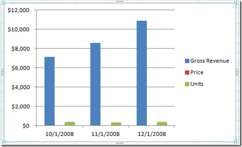
If we chart all 3 data points on the same chart, the human eye will not be able to discern that the Price is even plotted on the chart. Price in comparison to the Revenue is so small, it looks like zero on the chart.
This won’t work, but also notice that because the units are small in comparison to the revenue, it is very hard to determine what the unit values are and also if they have been changing over time.
So lets move the Units to the secondary axis.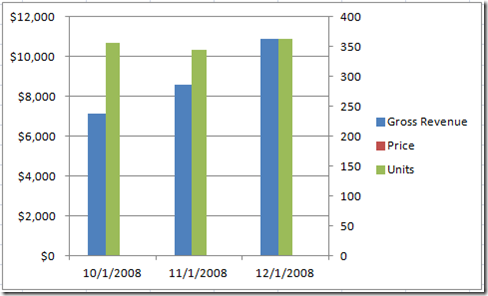
Now we can see and discern the Unit data. Price data is still too small since it is on the primary axis. So lets move that to the secondary axis as well.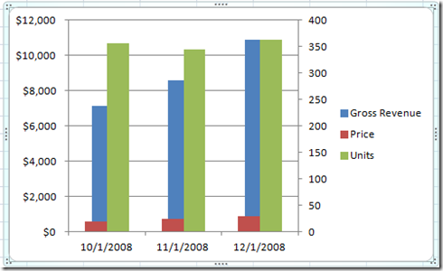
Now we can see the Price, but the changes are so small at this scale, it is hard to tell how much the prices have risen from month to month. Also, I am not sure the units in a column format is best since it looks similar to the revenues. And because the scales are different, it looks like the units are much more massive than the revenue even though the actual data points are 20 times less.
So we have a conundrum. How can we represent the data with 3 data points both large and small?
My Solution
Here is what I decided to do. Please let me know what you think of this solution. There are no right answers, but the more people can quickly and easily understand the data and its relationships, the more success we will have as dashboard designers.
Okay, I decided to modify the chart as follows.
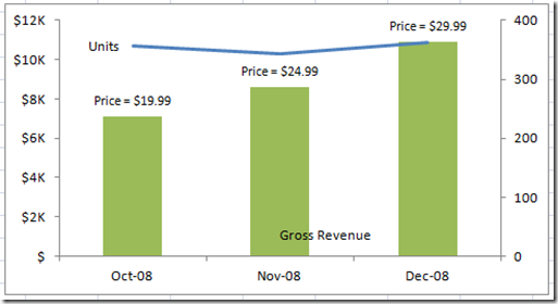
1) I deleted the Price series as part of the graph. The prices have each increased $5 each month. I will handle this in a different way by labeling each revenue column with the price per unit charged that month.
2) I changed the Units series to a line graph
3) I deleted all the chart junk: Legend and Gridlines.
4) I labeled the data points and series within the chart to replace the legend.
Here is the new chart:
I think it shows that the revenue has been increasing and even though we are increasing prices by $5 per month, the units sold have remained the same.
Do you think this is the best way to represent the data?
If you saw that chart in a newspaper article, could you quickly discern the data and relationships?
Let me know your thoughts and if you have a better way to represent the dashboard data.
Steve=True


