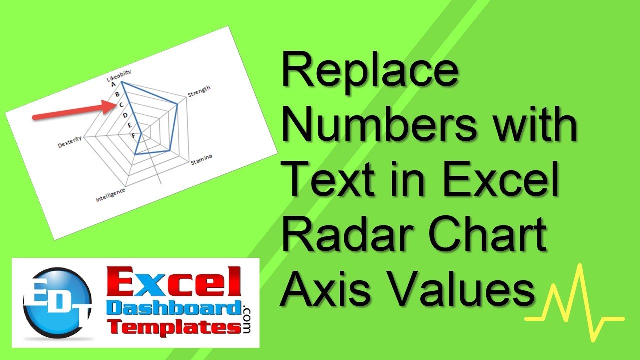
Replace Numbers with Text in Excel Radar Chart Axis Values
This is a cool Excel Trick that I just created based on a user request to change Excel Radar Chart Axis values from numbers to text. I even amazed myself.
Here was the use case/request from the user.
“Thank you so much for the informative video and lesson on radar charts. I was interested on how to replace the numbers with text. For example, instead of showing numbers on the axis of the radar chart, i want to show text like 4 should show “A”, 3 should show “B”. Not sure if my request is clear.”
– CLIVE
Excel has a lot of features, but it does not currently have the ability to change the Radar Chart Axis values to text. It probably goes against chart conventions, so not sure it will ever be an option, but that won’t stop us from creating the chart we need.
The Breakdown
1) Create Radar Chart
2) Create Alternate Data Range for Vertical Axis
3) Copy / Paste Alternate Data Range for Vertical Axis as Special as Columns
4) Move New Series to 2nd Axis
5) Change New Series Chart Type to Clustered Bar Chart
6) Change Secondary Vertical Axis Settings Reverse
7) Change Bar Chart Fill
8) Change Mock Data Legend Values
9) Change Secondary Horizontal Axis Options
10) Chart Clean Up
Step-by-Step
1) Create Radar Chart
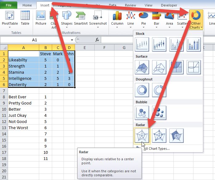
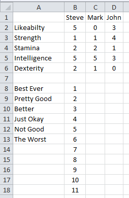
For this tutorial, we will have our initial radar chart data in cells A1:D6. TO create the radar chart, select that range and then go to the Insert Ribbon and select Other Charts and then choose the Radar Chart option.
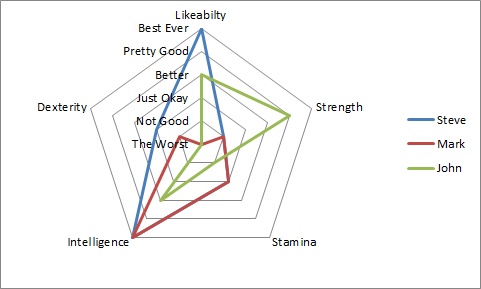
Your chart will now look like this:
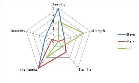
2) Create Alternate Data Range for Vertical Axis
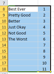
To create the Excel Radar Chart Axis with text, we need to fake Excel by adding another series to the chart. To create this fake, you will have to create you Text Labels for the vertical axis. You will see those values in cells A8:A13 below. But you will notice that I have added values in the column to the right (cells B8:B18) as we will need this range for a future step of creating a Clustered Bar Chart. The values in B8:B18 are just place holders and we will remove or zero out these values before we complete the chart.
So why do we have 11 numbers but only 6 text values? We do this so that we can align the values of our Bar Chart for the Vertical Axis Labels with the Radar Chart Axis labels.
There is a rule that you should determine the largest value of your radar chart, double that value and add one. This will make sure the vertical text and numbers will line up.
In this tutorial, the largest value is 5, so that means that I will need 5 text values from 1-5 and one for zero and then the repeating 5 below the zero value will be blank. So 5×2+1=11 categories for our bar chart. This will become more apparent in the 4th step below.
3) Copy / Paste Alternate Data Range for Vertical Axis as Special as Columns
You can add a series to your chart in several ways. This is the easiest for this tutorial. First Select the new series data range A8:B18:
Then select the Chart and select Paste Special from the Hom Riboon > Paste options. Or select the chart and then press ALT+E+S to bring up the Paste Special for Chart dialog box. Then choose “New Series” and “Columns” radio buttons and also the “Categories (X Labels) in First Column” check box and press okay.
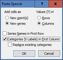
Your chart will now look like this:
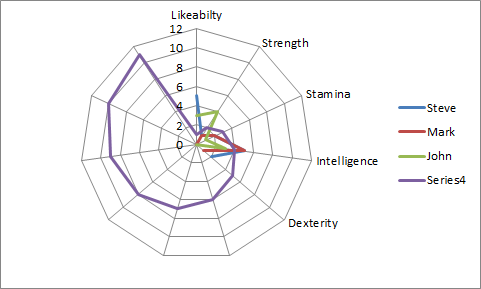
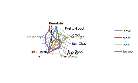
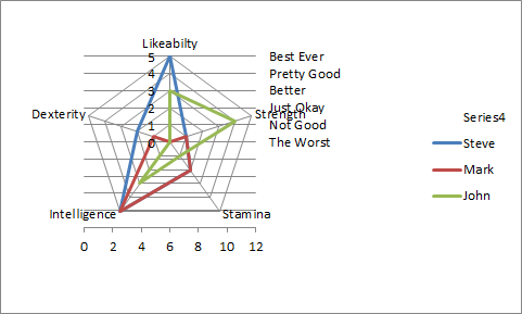
4) Move New Series to 2nd Axis
The purple “Series4” is the series that we just added. It has affected our chart, but do not fear, that is only temporary and it will even look worse on the next step. First Select the “Series4” series in the chart, then Press CTRL+1 and bring up the Format Data Series dialog box. From there, select “Secondary Axis” radio button and press OK.
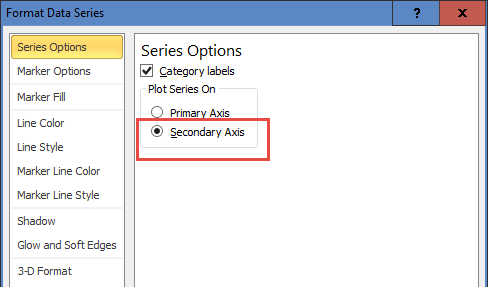
Your chart should now look like this:
5) Change New Series Chart Type to Clustered Bar Chart
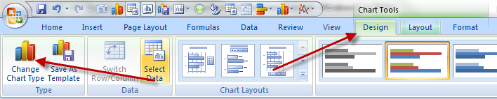
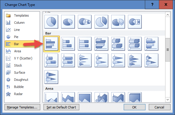
Here is where you will create the starting format of Text Values for your Radar Chart Axis. To do that, we will need to change the chart type of the newly created series “Series4” to a Clustered Bar Chart. To do that, select “Series4” and then go to the Design Ribbon and select “Change Chart Type” button.
You will now see the Change Chart Type dialog box. Navigate to the Bar chart types and then select the Clustered Bar Chart:
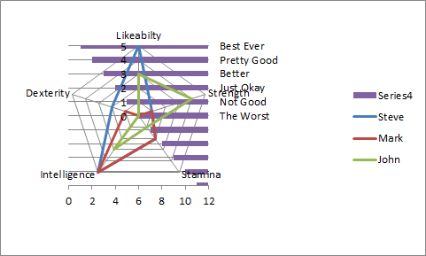
Your new chart will now look like this:
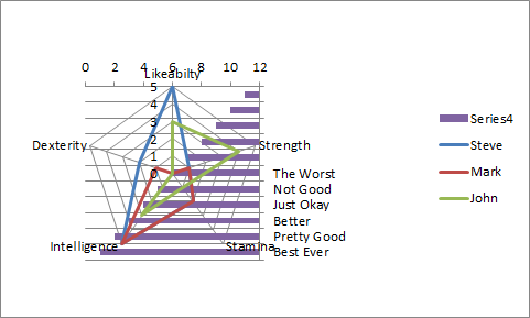
Like is said in the last step, it looks like we are making it worse, but that will all change in the next few steps.
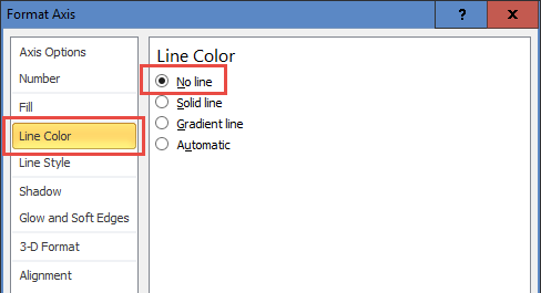
6) Change Secondary Vertical Axis Settings Reverse
To make our chart look better, double-click on the Secondary Vertical Axis and update the following:
a) Categories in Reverse Order
b) Position Axis on Tick Marks
c) Major Tick Mark Type = None
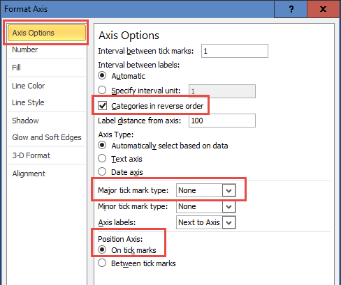
d) Line Color = None
Your chart will now look like this:
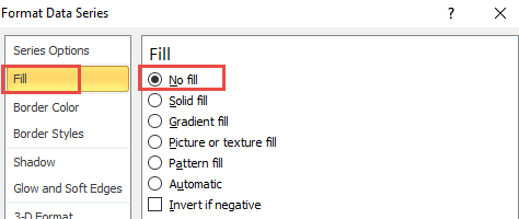
7) Change Bar Chart Fill = No Fill
In order to make sure that the Bar Charts are not visible on the chart, double-click on any of the purple values of “Series4” and then change the Fill Options to No Fill.
Your chart will now look like this:
8) Change Mock Data Legend Values = 0
Now that we have hidden the bar chart bars with a No Fill option, we can delete or zero out the corresponding values in the spreadsheet.
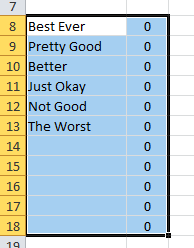
This is not a critical step but will help to ensure that you do not show any
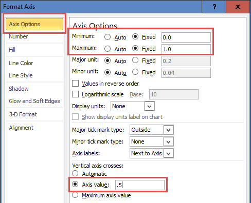
9) Change Secondary Horizontal Axis Options
This is the step that makes it all come together. Double-click on the Secondary Horizontal Axis and update the following:
a) Maximum = 1
b) Minimum = 0
c) Vertical Axis Crosses = 0.5
Your chart will now look like this:
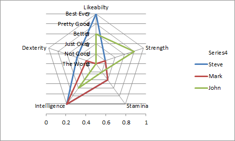
The chart is taking shape and our Text Values for the Radar Chart Axis in line where they need to be. Just a few items to clean up and the chart is done.
10) Chart Clean Up
To clean up the chart, we need to select the following items and press the delete key:
a) Delete Horizontal Gridlines
b) Delete Horizontal Secondary Axis
c) Delete “Series4” Legend Entry – To delete this, select the chart, then select the legend and then finally select the Legend Entry and press the delete key to only remove that value.
c) Delete Radar (Value) Axis – If you have a problem selecting this, check out the video below to see how you can select it from the Chart Layout Ribbon. Here is another video that describes this process for any chart element: SelectUnselectableChartSeries
Your final chart will now look like this:
It takes a bit of work and understanding that you need to add Double + 1 values in the series to match up the Bar Chart Categories with the Radar Chart Axis numbers, but all in all, it is a pretty solid technique. So much so that you won’t even notice that the numbers are gone and it is almost like we created a new chart type.
Video Demonstration
Check out this Video tutorial on the techniques presented above.
Sample File Download
Click here to Download the Free Sample Excel Template File:
Replace-Numbers-with-Text-in-Excel-Radar-Chart-Axis-Values.xlsx
I was so excited when I created this new Excel Trick as I wasn’t quite sure it was possible. Excel’s power never ceases to amaze me with its options and ability to make the chart you want, even the ability to fake a Radar Chart Axis label. What is your favorite Excel Trick? Let me know in the comments below.
Steve=True


