How-to Make a Thermometer Goal Chart in Excel
A friend and co-worker asked me if I had a tutorial on a building a Thermometer Goal Chart in Excel. I realized that I do have one:
Related Tutorials:
Company Goal Beer Mug Chart
Company Goal Beer Mug Chart
But it I don’t have one that looks like an actual thermometer, so I thought I would create one.
The Breakdown
1) Setup Chart Data
2) Create Stacked Column Chart
3) Switch Chart Rows/Columns
4) Move Thermometer Bulb Series to Secondary Axis
5) Delete Vertical Secondary Axis
6) Format Current Sales Data Point
7) Format Remaining Sales Data Point
8) Format Sales Above Goal Data Point
9) Create Thermometer Bulb
10) Change Gap Width of Primary Axis
11) Modify Vertical Axis Number Format
Note: There is an issue with this Tutorial. To fix the issue, check out this post:
Step-by-Step
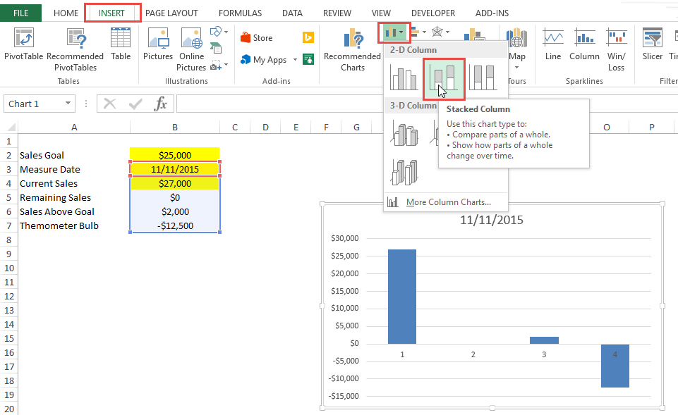
1) Setup Chart Data
First we need to set up our data for the chart. I recommend that you create a chart data range similar to what you see below.
a) Sales Goal = Value Entered by User
b) Measure Date = Date in Time for the Last Measurement Entered by User
c) Current Sales = Value Entered by User
d) Remaining Sales = If statement that returns Zero if we have reached our goal or the difference between current sales and the sales goal.
e) Sales Above Goal = If statement that returns Zero if we have not reached our goal or the difference between current sales and the sales goal.
e) Thermometer Bulb = Negative Value use to create a space below the thermometer
| A | B | |
|---|---|---|
| 1 | ||
| 2 | Sales Goal | $25,000 |
| 3 | Measure Date | 11/11/2015 |
| 4 | Current Sales | $27,000 |
| 5 | Remaining Sales | $0 |
| 6 | Sales Above Goal | $2,000 |
| 7 | Themometer Bulb | -$12,500 |
Worksheet Formulas
|
2) Create Stacked Column Chart
Now that we have created our Thermometer Chart Data, lets create the basic chart. It is essentially a Excel Stacked Column Chart.
To create the chart, highlight cells B3:B7 and then go to your Insert Ribbon and Select the Stacked Column Chart form the Chart Group.
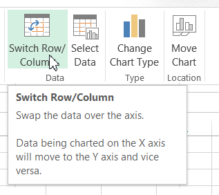
3) Switch Chart Rows/Columns
Now Excel didn’t create our chart the way we thought it would so we have to fix it. If you want to know why Excel created the Stacked Column Chart in this way, check out this post:
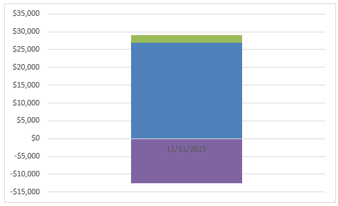
To get our chart into a stacked format, select your chart, then select the Design Ribbon and click on the Switch Row/Column button.
Your chart will now look like this:
4) Move Thermometer Bulb Series to Secondary Axis
We now need to separate our Thermometer Bulb series from the other series so that we resize the gap width of the columns without affecting the size of the Thermometer Bulb image. In order to do this, we need to move it to the Secondary Axis. To do this, double click on the Thermometer Bulb series so that the Format Data Point dialog box appears and move the data point to the Secondary Axis.
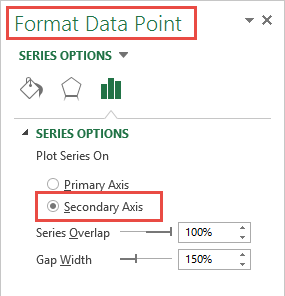
Your chart will now look like this:
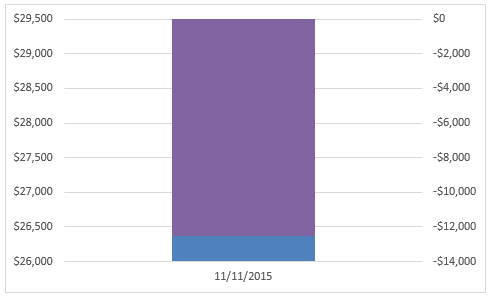
5) Delete Vertical Secondary Axis
Since we were only moving the Thermometer Bulb Series to separate it from the other stacked columns in the chart. That way we can change the gap width on the stacked columns without resizing the Thermometer Bulb image. To delete the Secondary Vertical Axis, simply click on the chart and then click on the Secondary Vertical Axis and then press your delete key.
After you delete the secondary your chart will look like it did before, but we have now separated the 2 stacks so that we can change the gap width.
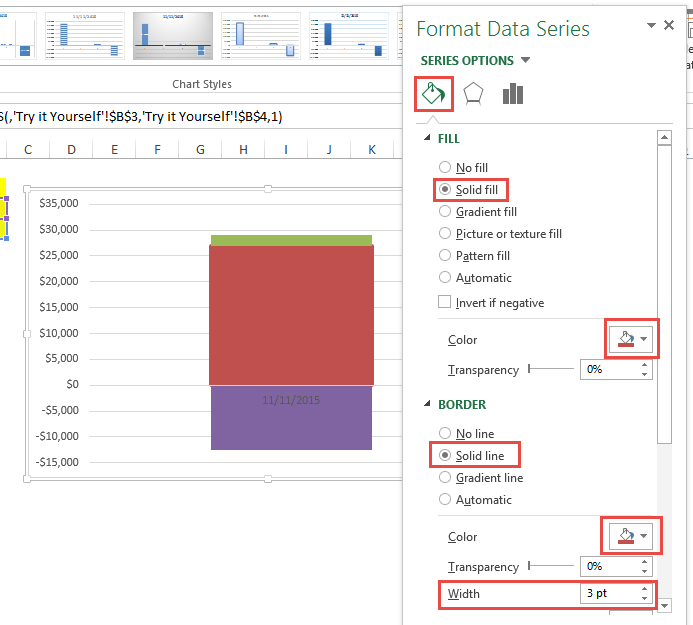
6) Format Current Sales Data Point
Now we can format that data series in the chart so that it looks like a thermometer that is filling up. If you can’t see the Current Sales Data Point, change your values in the worksheet so that it is visible. The first step is to format the Current Sales data point with all red and a red border. To do this, click on your chart, then double click on the Current Sales data point. This will bring up the Format Data Dialog box. Then from the Fill & Line options, change the Fill to a Solid Color of Red and the Border to a Solid Line with the Color of Red and a Width of 3PT.
Your chart will now look like this:
If you are having trouble selecting the right chart data series, check out this post:
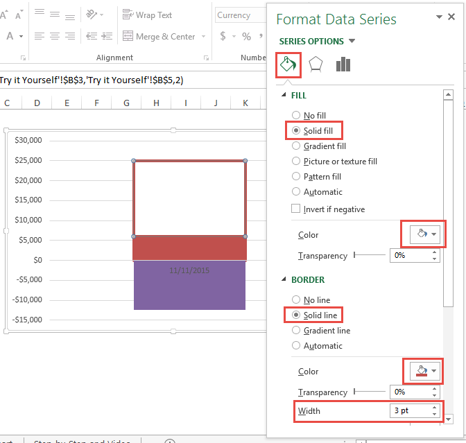
7) Format Remaining Sales Data Point
Now we need to format the Remaining Sales data series in the chart so that it looks like the empty part of the thermometer. If you can’t see the Remaining Sales Data Point, change your values in the worksheet so that it is visible.
The first step is to format the Remaining Sales data point with a fill color of white and a red border. To do this, click on your chart, then double click on the Remaining Sales data point. This will bring up the Format Data Dialog box. Then from the Fill & Line options, change the Fill to a Solid Color of WHITE and the Border to a Solid Line with the Color of Red and a Width of 3PT.
Your chart will now look like this:
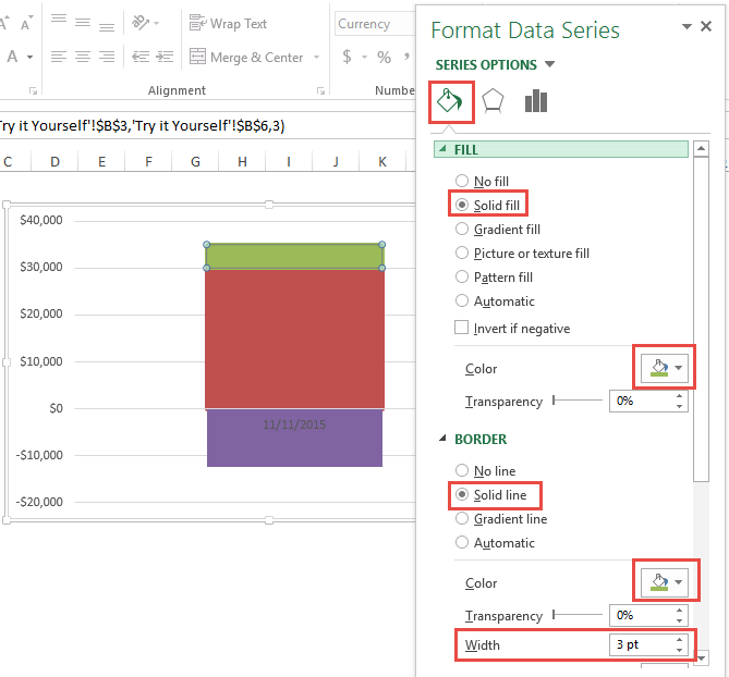
8) Format Sales Above Goal Data Point
Now we should format the Sales Above Goal data series in the chart so that if we beat the goal, you can see that value in green. If you can’t see the Sales Above Goal Data Point, change your values in the worksheet so that it is visible.
The first step is to format the Sales Above Goal data point with a fill color of GREEN and a GREEN border. To do this, click on your chart, then double click on the Sales Above Goal data point. This will bring up the Format Data Dialog box. Then from the Fill & Line options, change the Fill to a Solid Color of GREEN and the Border to a Solid Line with the Color of GREEN and a Width of 3PT.
Your chart will now look like this:
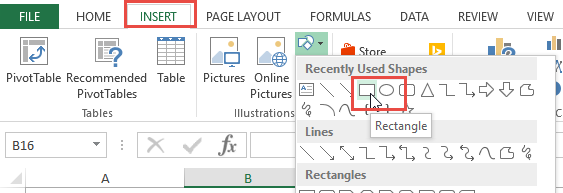
9) Create Thermometer Bulb
We are getting really close to the final chart but we need to add a Thermometer Bulb at the bottom of the chart. To do this, we first need to create a graphic that we can use as our rounded bulb.
Insert Shapes:
You first will need to go to your Insert Ribbon and then Insert a Circle shape into your worksheet and then Insert a Square shape into your worksheet area.
Your shapes should look like this:
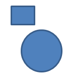
It is important that your Circle shape is a perfect circle otherwise it may not match well with the stacked column series. In order to do this, check out this post: Excel Shapes
Change Fill Color:
Then after you have created your shapes, you should change the shape fill and outline color to RED so that it will match the stacked column series. Your shapes should look like this:

Align Shapes:
Next you will want to place the square on the top of the circle and align both to their centers so that it looks like this:
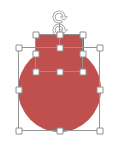
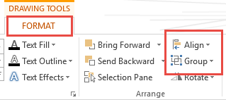
If you don’t know how to align the shapes to their center, you can select both shapes by holding down your shift key and then from the Format Ribbon, select the Align > Center Button. After you align the shapes, you will then want to group the 2 shapes together from the same Format Ribbon with the Group Button.
Your Thermometer Bulb Shape will now look like this:

Group Shapes:
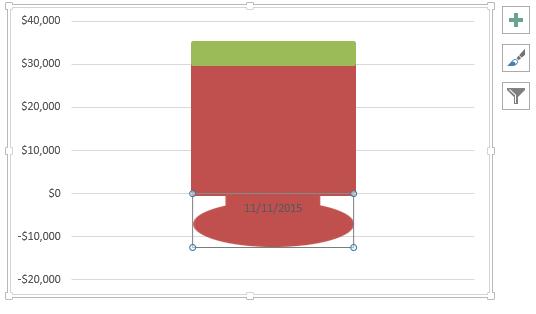
Finally, we are ready to add this shape to our chart. To do that, select the Grouped Thermometer Bulb Shape and then copy it by pressing CTRL+C on your keyboard. Then select your chart and select the Thermometer Bulb series in the chart and paste the grouped shape by pressing CTRL+V on your keyboard. This will replace the standard column shape with your new custom shape.
If you want to learn more about this technique, check out this post: Custom Markers
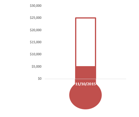
Your chart should now look like this:
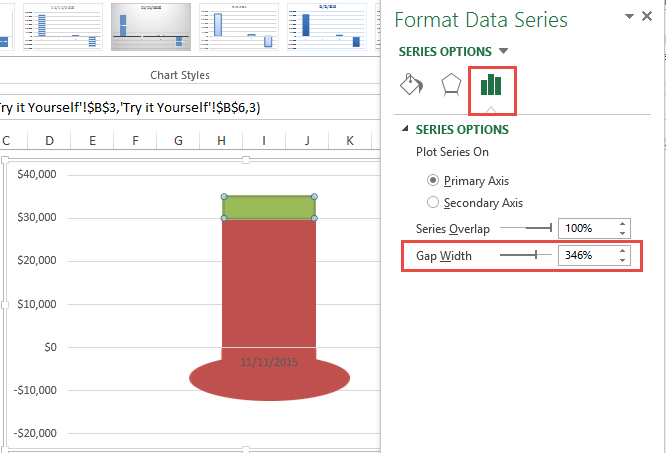
10) Change Gap Width of Primary Axis
We are really close to completing the Excel Thermometer Goal Chart. To match up our new custom shape, we need to increase the gap width of the Stacked Column Chart Series. To do this, double click on the Stacked Column Chart series like Current Sales or Remaining Sales. Then change the Gap Width until it matches your new thermometer bulb series. It may be around 300%.
You may also want to adjust the chart size or the plot area size until you get the desired look. I also changed the Horizontal Axis Text Color to White.
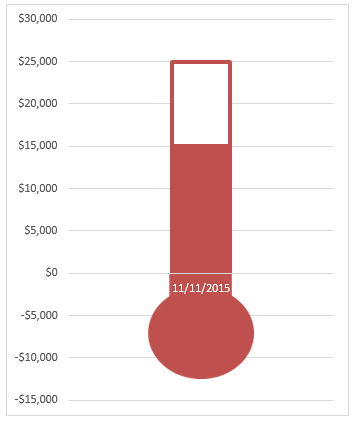
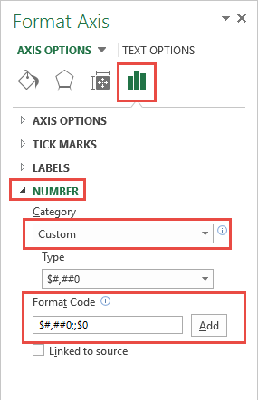
11) Modify Vertical Axis Number Format
The final chart change that I would recommend is to modify the negative values that appear in the Vertical Axis.
To do this, you will want to double click on the vertical axis and create a custom Number Format.
The custom number format that I might use would be the following:
$#,##0;;$0
If you want to learn other techniques with custom number formats, check out this post:
Your final chart will look like this:

Note: There is an issue with this Tutorial. To fix the issue, check out this post:
Video Tutorial
You can watch a video demonstration here:
Here is the quick way to fix the Current Sales Greater than Sales Goal issue:
fix-sales-goal-error-of-excel-thermometer-chart
File Download
You can download the free sample Excel Thermometer Goal Dashboard Chart here:
How-to-Make-a-Thermometer-Chart-in-Excel.xlsx
Hopefully this helps you create your own Thermometer Goal Dashboard Chart for your company. Let me know how you can use this type of chart in your Company Dashboards in the comments below.
Steve=True


