Sorry I have been swamped on a new project in Australia and Singapore so my posts have been less frequent than I wish. We had a successful launch in Melbourne and Perth. I am off to Darwin and Singapore next so hopefully I can get more posts completed on the flights.
Anyway, on to more Excel Dashboarding ![]()
So I have a good friend that was here at the start of my Excel Dashboard Template blog and his name is Don. Don is a retiree living in the Mid-west of the USA and he likes to track things using Excel and then he likes to see his data visually. Don also likes to use Excel to track everything about the Doctor Who series. But that is for another post.
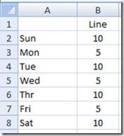
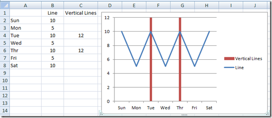
Recently, Don sent me an email and asked if I could help him add a vertical line to a chart in Excel. The Excel chart was a line chart. So he sent me a sample chart (see the Excel Line chart pictured below) and he wanted to add 2 vertical lines. One above Tuesday and one above Thursday. Below are step by steps for each of the 3 methods and video is linked at the end of the post.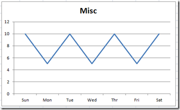
Here is what the final chart should look like: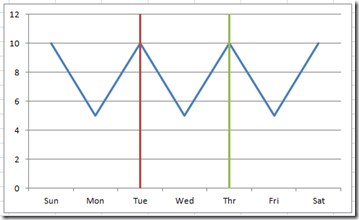
So in this post I will show you 3 ways that you can Add a Vertical Line to an Excel Line Chart.
So we will start with this data:
1) Add a Vertical Line using Excel Shapes
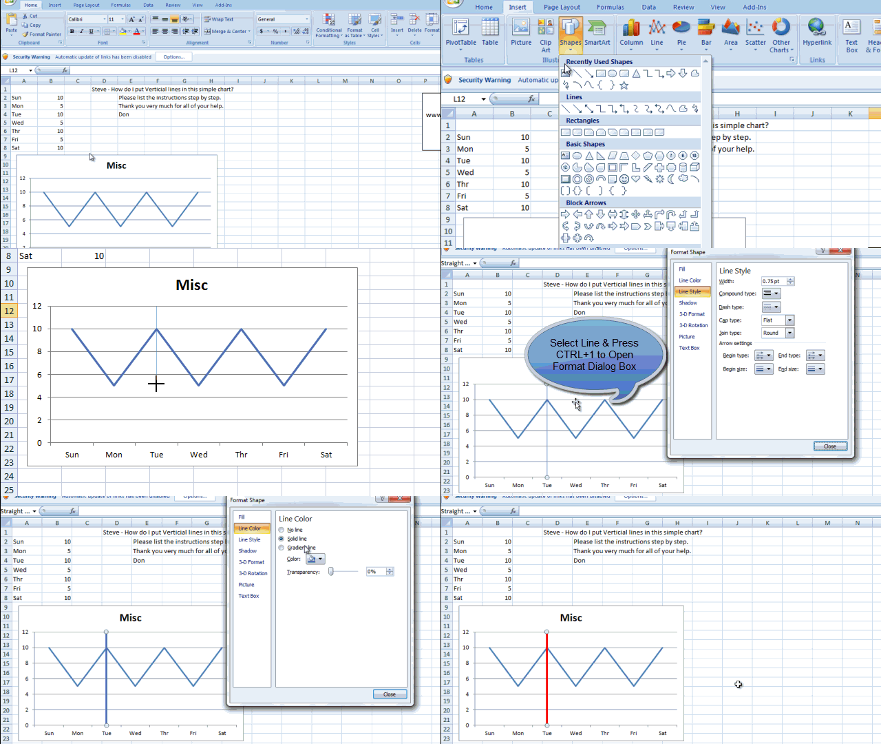
The 1st and typically easiest way to Add a Vertical Line to an Excel Line Chart is to just draw an Excel Shape of a Line on top of the Excel Line Chart.
A) Create your Excel Line Chart
B) Select Insert Ribbon
C) Select Shapes in the Illustrations Group
D) Select the Line without arrows in the line section
E) Draw your Line on top of the Excel Line Chart you have already created.
F) With the Line selected, Press CTRL+1 to format the Excel Shape
G) Change the Width to 3pt
H) Change the Line Color to Red
This is really the easiest way to add a line, HOWEVER, the line is not very dynamic and may get “OUT OF LINE” if you will when you add new data points to your line chart. So you will have to constantly adjust the line as the chart adjusts.
2) Add an Additional Column Series
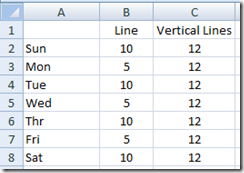
This is my recommended way to quickly and easily add as many vertical lines as you want to your Excel Line Chart. It is dynamic and can be controlled with formulas and it will move and adjust as you add data points.
A) Add an additional column of data that will create an additional line series in your Excel Chart. You will see that I have added a data point for each day at a value of 12. This is 20% above the real data because I want the vertical lines to go above the data and reach the maximum vertical position of the vertical axis. (Note, you will set this vertical axis maximum as detailed below.)
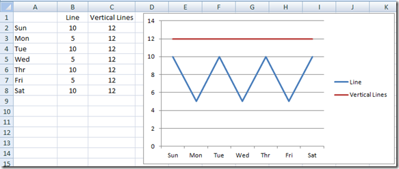
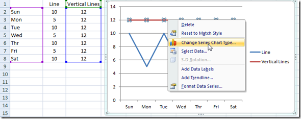
B) Highlight the New Data Range and Create your Line chart. You will have 2 horizontal lines and your graph will look like the picture below. Note, you can see the red horizontal line (titled Vertical Lines) because we have put a value for every day. If we had only put a 12 on Tuesday and Thursday, we would not have seen the line because they would have been two data points that were not adjacent, thus it would not depict a line for you to easily see and select.
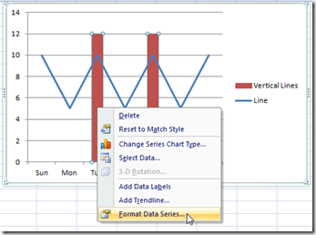
C) Right Click on the Vertical Line Series. In this case, the Red Data Series. Then from the Pop up menu, choose “Change Series Chart Type…””
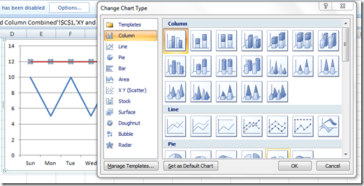
D) Change the Excel Chart Type to a 2-D Clustered Column Chart.
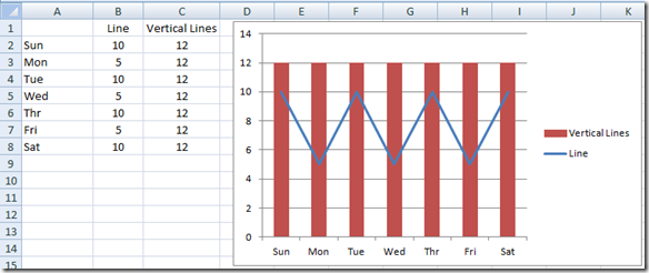
It will then look like this:
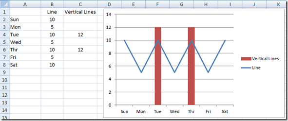
E) We are getting very close. Lets change a few things. First, we wanted to only have vertical lines at Tuesday and Thursday. So lets delete the Vertical Lines data values from all days except Tuesday and Wednesday. Your chart will now look like this:
F) Now lets make the columns look more like lines by changing some of their formatting. First, right click on either column and then choose the “Format Data Series…” from the pop up menu.
and then move the Gap Width slider to the right toward the Large Gap. The farther right you move it, the smaller the column will appear. It can get very small and will almost appear as a line.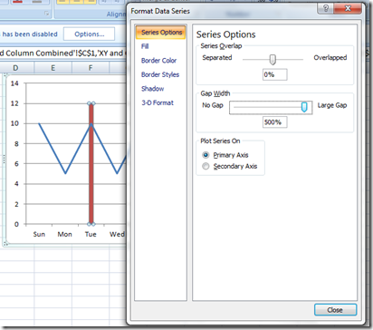
On a line chart with very few horizontal categories, the column will not get much thinner than this: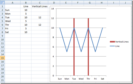
But when you more than about 20 categories, the column will get very very thin and will appear as a line. Compare these vertical columns/lines with the ones in the picture above. You will see that they are thinner than the ones above, but the ones above are very acceptable to me.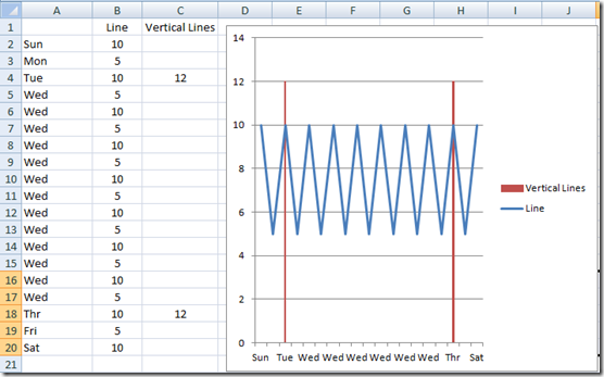
G) Okay here is the final step for the easy dynamic vertical lines. Right click on the Primary Vertical Axis and then choose “Format Axis…” from the Excel pop up menu. 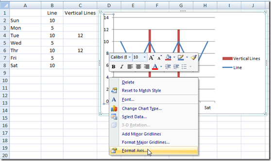
Then from the Format Axis Dialog Box, you should change the Axis Options Maximum to 12 (equal to the amount you have in your vertical lines column.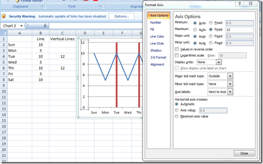
This will make the lines appear that they go from the bottom of the vertical axis to the very top. Here is your final chart.
Looks good to me. What do you think? Let me know in the comments.
Alright, you may be saying that I have tried this, but I noticed that your vertical lines using this technique all have the same formatting like the fill color. And you are correct. Here is the way to add one line for Tuesday and one line for Wednesday.
a) Add another column of data for each line. In the picture below, I made the 2nd vertical line data set = 10 for each value so that you can discern each line individually. If I set them both to 12, they would overlap and you would not be able to tell them apart as easily. You can all ready see that the 2 lines have different colors. Your data set and new line chart will look like this: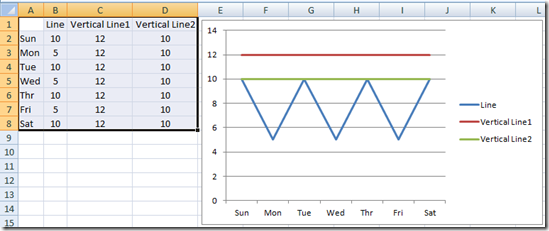
Then you will have to change each series chart type to Clustered Column Chart and follow each step from C thru F. Also, you will want to change the values for the Vertical Line 2 data series back to 12 so that it will reach to the top of the chart. When doing so, your chart will now look like this: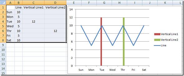
3) Add a Vertical Line using an XY Scatter Lines
Okay, here is the 3rd way to add vertical lines to your Excel Line Chart. There is a 4th way that I discovered, but it is a real pain in the you know what. If you want to know more about this 4th way, you can see this on this post:
The 3rd way is a little trickier to complete, but I am sure that if you follow my steps that you too will be able to do it. This is a great technique to master because it will allow you to add any line to most 2D chart types.
A) Create your Excel Line Chart with the original set of data that looked like this: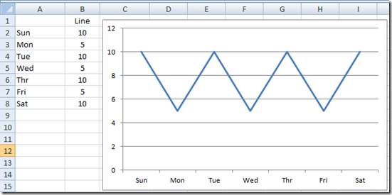
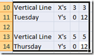
B) Now create 2 sets of data anywhere in your Excel Spreadsheet that looks like this:
C) Now I recommend that you highlight and COPY the Tuesday data from the upper right hand corner down one cell to the 12. Your range would look like this: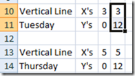
then Select your Chart and select “Paste Special”. You will then see this Dialog Box: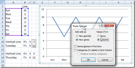
Then click on OK and your chart will now look like this:
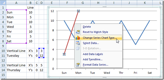
D) Now you may say that this is NOT a vertical line. And you are correct ![]() . However, here is how we start the transformation to an XY Scatter Chart. First, Right Click on the Vertical Line Series. In this case, the Red Data Series. Then from the Pop up menu, choose “Change Series Chart Type…””
. However, here is how we start the transformation to an XY Scatter Chart. First, Right Click on the Vertical Line Series. In this case, the Red Data Series. Then from the Pop up menu, choose “Change Series Chart Type…””
and then change the chart type to an XY (Scatter) – Scatter with Straight Lines: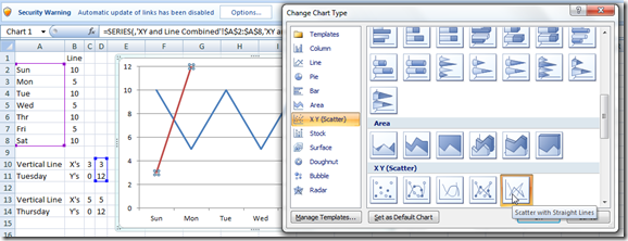
Your resulting chart will now look like this. Doesn’t look any better, but we are now very very close ![]()
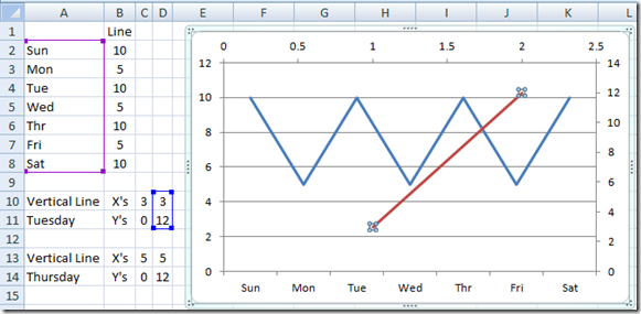
E) Now select your chart and then from the Design Ribbon, choose the “Select Data” button from the Data Group.
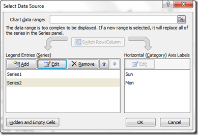
and you will then see this dialog box. You will then want to select “Series2” from the Legend Entries (Series) area. then click on “Edit”
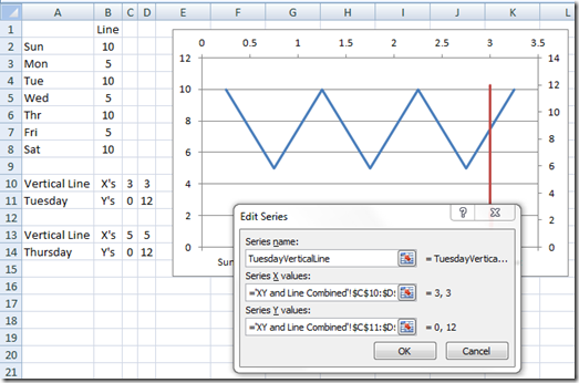
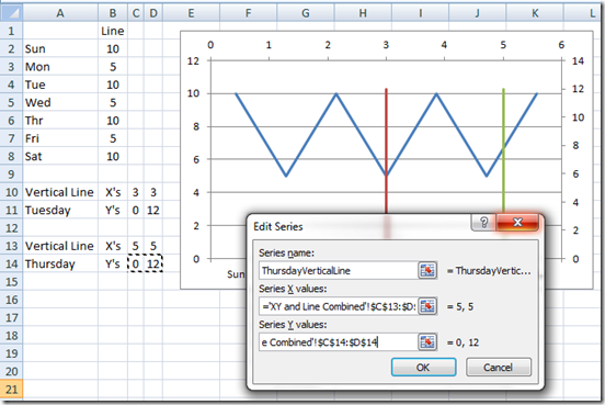
Now when you click edit, you will see the Edit Series Dialog Box. Give your series a title, so that you can easily recognize it in the future. Then change the Series X Values to the X’s for Tuesday and change the Series Y Values to the Y’s for Tuesday.
And then press OK but don’t close down the “Select Data Source” dialog box as you need it in the next step. Now looking at the chart, you will see a Vertical Red Line in your Excel Line Chart.
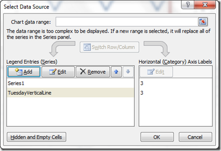
F) Now we have only created one line, so lets create the 2nd line. To do this, you need to ADD an new series in the Select Data Source dialog box.
From the Edit Series dialog box, add the Thursday vertical line data by adding the X’s and the Y’s like this:
then go ahead now and click on the OK from the “Select Data Source” dialog box. IMPORTANT: if you click “Cancel” at this step, you will have to start over editing BOTH XY data series as Excel will think you want to start over with the edit of all series for the chart since you stated to edit them.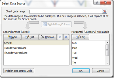
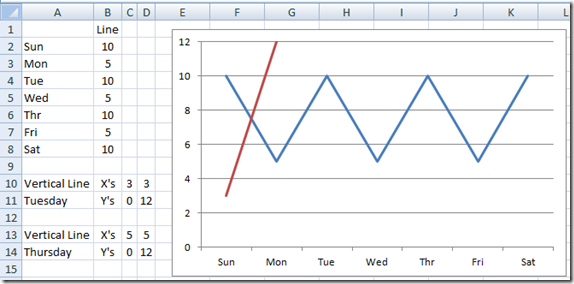
Your chart will now look like this: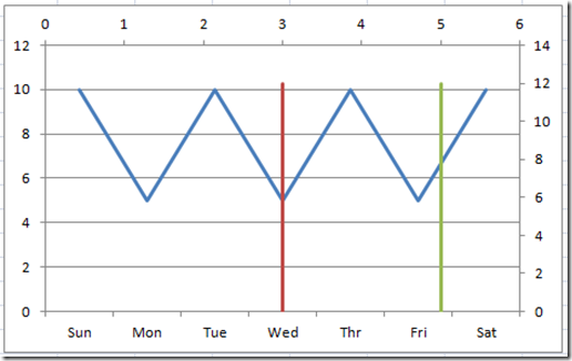
This is when you say Steve, why is the data not lined up with Tuesday and Thursday?
Well that is because we need to do one final step! That is to simply delete the Secondary Horizontal Axis and Secondary Vertical Axis.
G) Click on the Horizontal Secondary Horizontal Axis and press the delete key on your keyboard and then select the Secondary Vertical Axis and press your delete key. And boom goes the dynamite and you get this chart: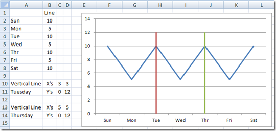
H) Okay here is the final step for the actual vertical lines. Right click on the Primary Vertical Axis and then choose “Format Axis…” from the Excel pop up menu.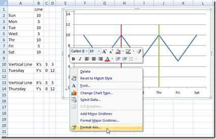
Then from the Format Axis Dialog Box, you should change the Axis Options Maximum to 12 (equal to the amount you have in your vertical lines data.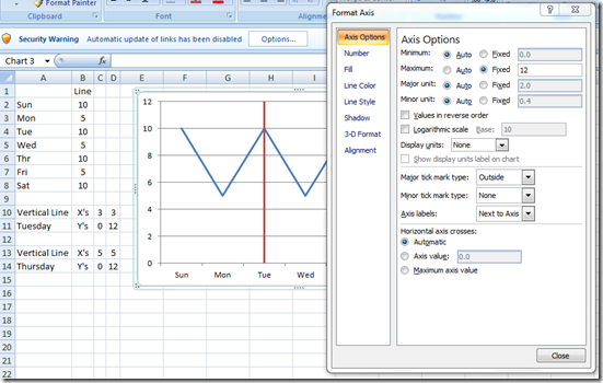
This will make the lines appear that they go from the bottom of the vertical axis to the very top. Here is your final chart: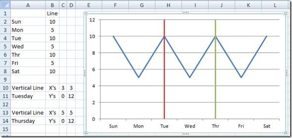
These are actually lines, not columns, but I think either can be fine. Looks great to me. What do you think? Let me know in the comments.
VIDEO Demonstration
Additional Tutorial mentioned in the video:
how-to-select-data-series-in-an-excel-chart-when-they-are-un-selectable
I want to thank each and every one of you again for subscribing to my blog and making it so successful. THANK YOU!
Steve=True
