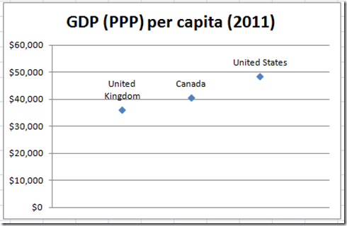
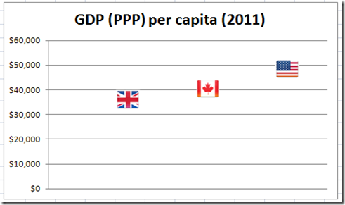
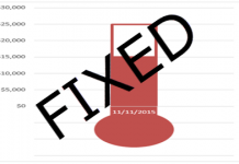
When is a picture worth a thousand words? Definitely when you use custom markers in your Excel Charts.
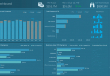
This will make your Excel Dashboard Charts stand out even more than using any type of 3-D Excel Chart.
Here is the same data for what is essentially the same chart, but which Excel chart type would you choose or which chart do you prefer?
I like the one with the flags for my Excel Executive Dashboard. How about you?
Okay, so how can you do this in your next Excel Company Dashboard? Here is the process. Also, there is a Excel Chart Video Tutorial at the end of this post.
The Breakdown
1) Create your Excel Chart with a (XY) Scatter Chart.
2) Create your Custom Markers
3) Replace Data Points with your Custom Markers
4) Remove the Chart Legend
5) Remove the Horizontal Axis
The Step-by-Step Tutorial
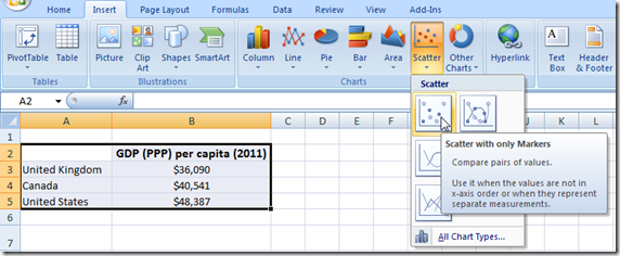
1) Highlight your chart range and then create your Excel Chart using the Scatter Chart with Only Markers.
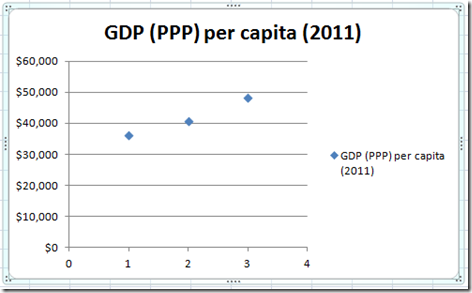
The resulting Excel Scatter Chart will look like this:
2) Next you must create your own custom markers. You can create your own custom markers for your Excel Chart generally in 2 ways.
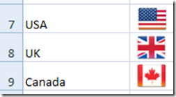
a) Copy any graphic or picture that you like and paste it directly into Excel. As you can see here, I copy and pasted the country flags directly into the spreadsheet:
or
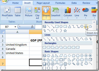
b) From the Insert Menu in the Illustrations group, do one of the following:
i) Insert a Picture from a File: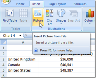
ii) Insert Clip Art: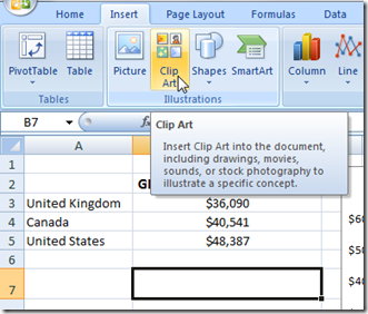 iii) Insert Shapes:
3) Now that you have your custom Excel markers created, you can now insert them into your Excel chart. To add your custom markers to the chart, simply follow these steps of a basic copy and paste:
a) Copy on the first picture or clip art or shape
b) Select the Chart
c) Select the Data Point by clicking on the data point “twice” (2 times) so that you are sure you have selected the data point. If you do not select a single data point by clicking on it 2 times, you will ultimately change all data points since we only have one series. So to repeat, click on the data point 2 times so that you only change one marker.
d) Paste the Marker
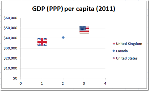
e) Repeat these steps for each marker. Here is what the chart would look like with a country flag replacing 2 of the three data points:
You will notice that when you replace the standard marker with a custom marker that it also changes the legend marker with the custom marker: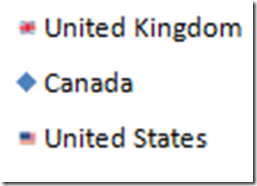
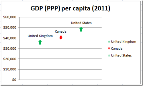
Here is another sample of the same chart with a red or green up/down arrow. I added the data labels so that you
You can see that with a little thought and ingenuity, you can pack a lot of information into your Excel Dashboard. What is your favorite picture, clip art or shape that you will use in your next Excel Chart? Let me know if the comments.
The Excel Video Tutorial
The Producer
Steve=True (an Excel Fan)
The Call to Action
If you like these Excel Blog posts and Excel Training Videos, please make sure you sign up for my RSS feed and YouTube! Channel.

