Time for some beer and Excel. Last month I saw that a User was wondering how to make Beer Mug Goal Chart for their company in order to track progress toward a celebration. Today, I am going to show you how to make your own Beer Goal Chart (maybe I should have called it a beer goggle chart ![]() ) that can be used as an Excel Dashboard component or maybe just as a company status chart or a fun challenge chart. Whatever you want to use it for, you can use this technique to make many infographic type charts in Excel.
) that can be used as an Excel Dashboard component or maybe just as a company status chart or a fun challenge chart. Whatever you want to use it for, you can use this technique to make many infographic type charts in Excel.
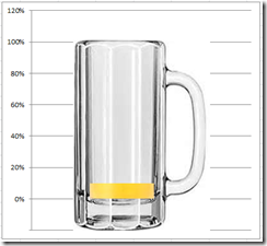
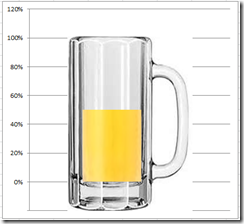
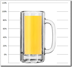
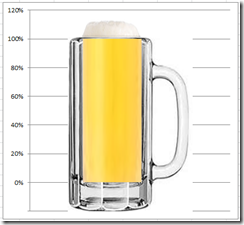
Here is what the chart can do all with standard functionality. Here the chart with 10%, 50%, 90% and 115% (notice that the chart at 115% shows foam above the beer. Pretty cool, huh?)
Looks real enough for what we need to do. Now let’s get to it and see how we can make this custom infographic beer chart that will update itself without the need to draw anything when you change the values. All we need to do is use standard Excel charts. Enough talk, get to making the chart already!
The Breakdown
1) Find image graphic for Beer Mug, one for the Beer and one for the Foam
2) Insert graphics into Excel Beer Mug Goal spreadsheet
3) Copy and crop mug into 2 graphics, and crop beer and foam graphics
4) Create a chart data range and beer level cell in the spreadsheet
5) Create Excel 2D Clustered Column chart
6) Copy and paste beer much goal chart graphics into 2D Clustered Column chart
7) Move Beer and Beer position series to the Secondary Axis
8) Change the Current Beer Level Chart Type to 2-D Clustered Column
9) Change Current Beer Level Gap Width and Series Overlap
10) Clean up the chart junk
11) Change primary vertical axis minimum, maximum and number format
Step-by-Step
1) Find image graphic for Beer Mug, one for the Beer and one for the Foam
First thing we need to do is to find a graphic that we can use in our Excel Chart. We are looking for several graphics. One, an empty beer mug, two, a mug with beer, and three, a mug of beer with foam on the top.
If you cannot find these pictures in Excel or in Clip Art, I suggest looking for images that are available and licensed for use on the web. If you can’t find an image that are licensed for use, then you should visit some of the large stock photo sites and purchase images.
Here are the photos I used for the empty mug of beer: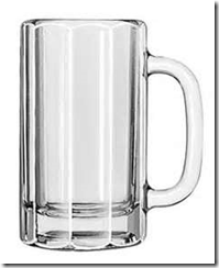
Here is the photos that I used for the beer graphics:
Here is the photos that I used for the beer foam: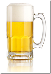
Once you have a few pictures saved to your computer, now you can start the process.
2) Insert graphics into Excel Beer Mug Goal spreadsheet
First we need to insert the beer graphics into your spreadsheet. You can do this by going to the Insert ribbon and then choose Picture or Clip Art. 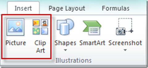
From there find your image on your computer and then press the insert button on the dialog box.
3) Copy and crop mug into 2 graphics, and crop beer and foam graphics
Okay, now each of our pictures are not exactly what we want. So you need to crop the pictures in order for them to work the way we wanted them. So we will need to make a copy of one and then crop each of them.
First things first, we need to make a copy of the empty mug. Simply click on the empty mug, then press Ctrl+C and then Press Ctrl+V and you should now have 2 empty mug graphics.
Next we need to crop each picture. To crop a picture, first select the picture and go to the Format menu and choose the Crop button from the Size group. Your picture should now have black crop selectors showing in the picture like you see below.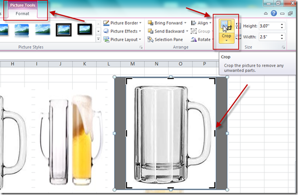
You will need to crop each of the pictures into the following graphics:
a) Empty Glass from the base of the inside of the glass to the BOTTOM of the mug:![]()
b) Empty Glass from the base of the inside of the glass to the TOP of the mug: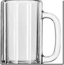
If you need to know if you have cropped them right, simply put both the top and the bottom together in the Excel Spreadsheet and see if they line up. I have moved them slightly off so that you can see that they are actually 2 different pictures. If I didn’t, you would swear that it is just one picture and not two in the spreadsheet.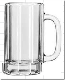
c) Beer only in the form of a long rectangle:
d) Beer Foam only:
We now have our graphics ready and can start building our chart.
4) Create a chart data range and beer level cell in the spreadsheet
One of the keys to this Excel Chart tip and trick is to set up our data in the right way.
We need to setup our data for the chart and also a cell that will control the beer (goal) level for the dashboard graphic. It will look like this:
Lets review each of the cells
The lower mug of –20% will be for the bottom of the mug graphic that we cropped above.
The upper mug of 101% will be for the top of the mug graphic that we cropped in the above step
The Beer positions of 0% are how we will position the graphics so that the beer and the beer mug are in the same space. Without these the beer and the mug would be floating in different spaces.
The Current Beer Level of 100% is a formula that looks at our yellow spreadsheet cell of E1 and if it is equal to or greater than 100%, then limit it to 100% or else just use the value in cell E1.
B5 =IF(ISNUMBER(E1),IF(E1>1,1,E1),0)
The Beer Foam series is how much above and beyond the goal of 100% the company has attained. If you see foam, you know it will be a real party because we have exceeded our goals. The formula for this cell will be equal to the difference of cell E1 minus cell B5 that is above 100%
B7 =IF(B5=1,E1-B5,0)
Make sure you set cell E1 equal to the current beer achievement level. This is the only cell you need to change.
5) Create Excel 2D Clustered Column chart
We can now make our Excel Beer Graph. Highlight cells A1:B7 and then go to the Insert ribbon and 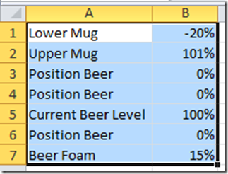
choose the 2-D Clustered Column Chart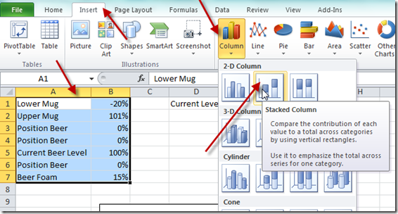
Your chart should now look like this: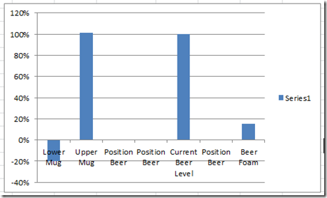
Not quite what we want, so we need to press the Switch Rows/Columns button on the Design ribbon. Your chart should now look like this: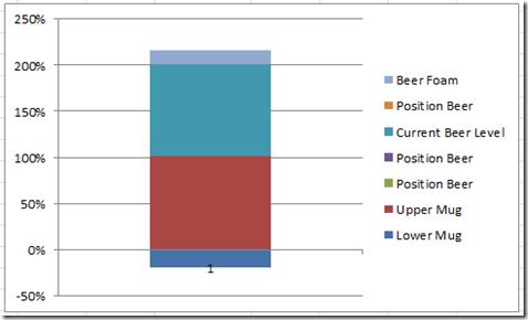
Check out this post if you don’t know:
Why Does Excel Switch Rows/Columns in My Chart?
6) Copy and paste beer much goal chart graphics into 2D Clustered Column chart
Okay, we are really close, now lets add our beer graphics.
First select your Upper Empty Beer Mug and Press Ctrl+C to copy it.
Then select your chart and then select the Upper Mug and press Ctrl+V to paste it.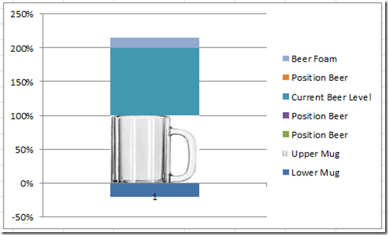
Repeat this step for the Empty Bottom Beer Mug graphic by selecting it and pressing Ctrl+C to copy.
Then select the Lower Mug data series in the Excel Company Goal Chart.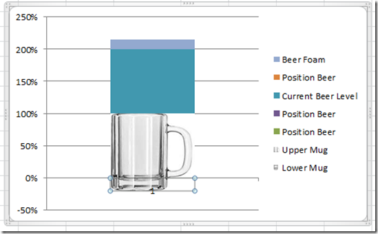
Now we need to copy and paste the Beer to the Current Beer Level series. 
Following the same steps your chart will look like this: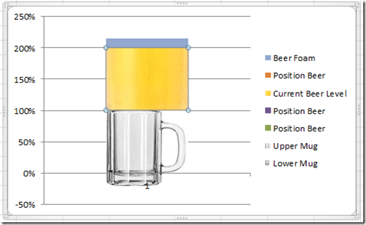
Finally, we need to repeat this for the Beer Foam Excel Chart Data Series. Select your foam graphic and press Ctrl+C to copy it.
Then select the Beer Foam in the Excel Graph and press Ctrl+V to paste it: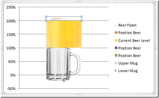
Looks close, but why is the beer floating above the beer mug? Because we need to move the beer and foam to the secondary axis.
7) Move Beer and Beer position series to the Secondary Axis
We need to move the following series to the secondary axis. You do this by selecting the series you want to move to the secondary Excel horizontal axis and then press Ctrl+1 to bring up the Format Data Series dialog box. Then choose Secondary Axis in the Plot Series On in the Series Options: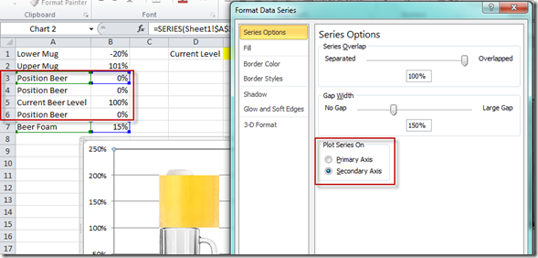
You need to move all 3 of the Position Beer series and also the Current Beer Level.
Your chart should now look like this: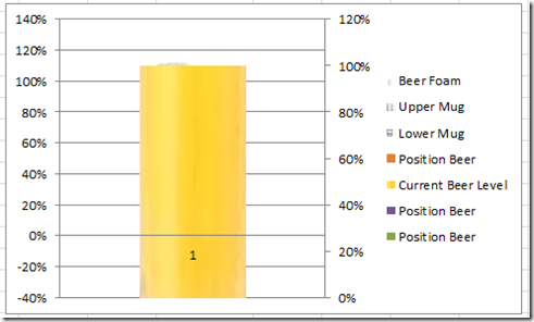
If you are having problems selecting the Position Beer Series that are equal to Zero, check out this post:
How-to Select Data Series in an Excel Chart when they are Un-selectable?
8) Change the Current Beer Level Chart Type to 2-D Clustered Column
Since our beer mug has a handle, it throws the beer to the left of the graphic so we need to move our beer as well. To do this, select the Current Beer Level series in the chart. Then go to the Design ribbon and choose the Change Chart Type button in the Type group. Then from the dialog box, select Column types and choose the 2D Clustered Column (NOT the Stacked Column)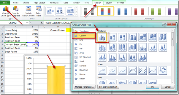
Your chart will now look like this: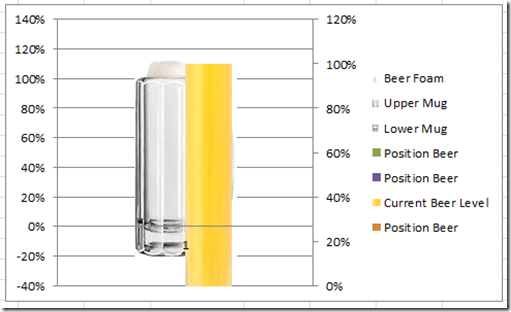
OOPS!!! Looks like I poured the beer and missed the mug ![]() No worries, we can fix this. We need to move the Current Beer Level Series either up or down above or below the Position Beer series. In our case we need to move it up one level in our series order. You can do this by selecting the chart, then go to the Design ribbon and press the Select Data button.
No worries, we can fix this. We need to move the Current Beer Level Series either up or down above or below the Position Beer series. In our case we need to move it up one level in our series order. You can do this by selecting the chart, then go to the Design ribbon and press the Select Data button.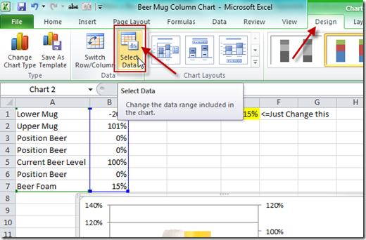
You will then see the Select Data Source dialog box. Select your Current Beer Level and then press the up arrow as you see below: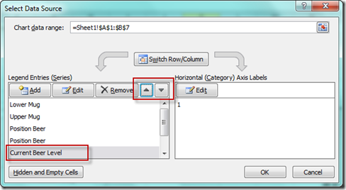
Now are chart looks very close but will need a little more tweaking: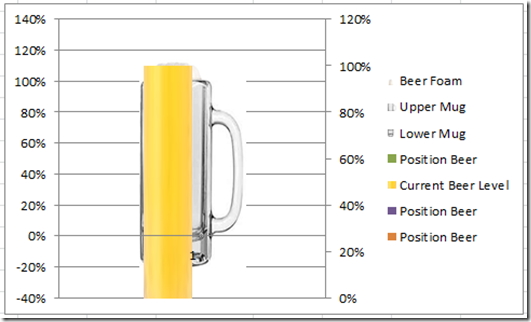
9) Change Current Beer Level Gap Width and Series Overlap
Even though our beer mug is close, it is not perfect so we need to slide the beer over a little by making the following adjustments. Click on the Current Beer Level Series and press Ctrl+1 to bring up the Format Data Series dialog box. Then change the Gap Width to 180% and the Series Overlap to 45%.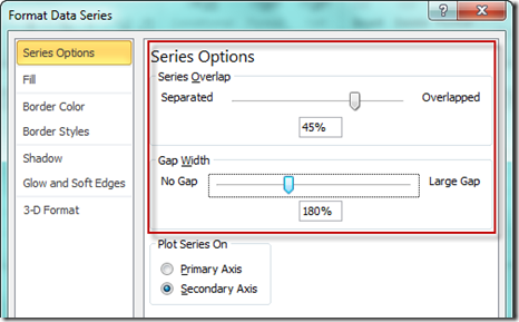 These numbers are not set in stone, so tweak them until the beer looks like it is in the empty mug.
Here is what mine looks like now: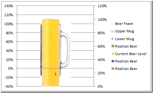
10) Clean up the chart junk
Things are looking too crazy, so lets clean things up before we finish.
Delete the Legend
Delete the Horizontal Axis (has the number 1 in the middle of the beer)
Delete the Secondary Vertical Axis
Your chart should now look like this: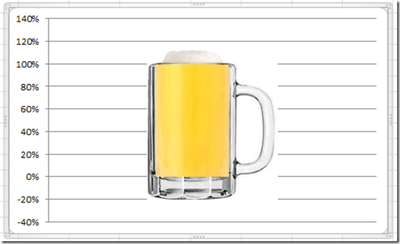
11) Change primary vertical axis minimum, maximum and number format
For the final step, lets adjust the Vertical Axis so that our graphics will match the Zero to 100% gridlines.
Right click on the Vertical Axis and Press Ctrl+1 and you will see the Format Axis dialog box with the Axis Options selected. Change your Minimum to –0.20 and change your Maximum to 1.20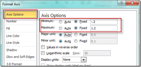
Then select the Number options on the left and then select Custom from the Category choices and put this
0%;;0%
in the Format Code box and press the Add button: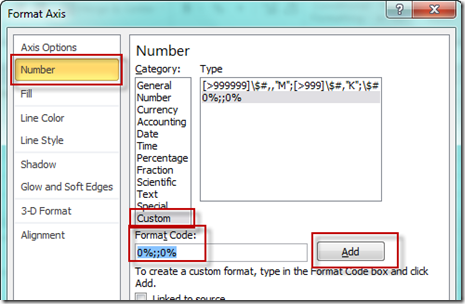
If you want to learn more about custom number formats, check out these postings:
How-to Format Chart Axis for Thousands or Millions
Remove The Zero Point or Make a Hole in an Excel Radar Chart
And there you have it, here is our final chart.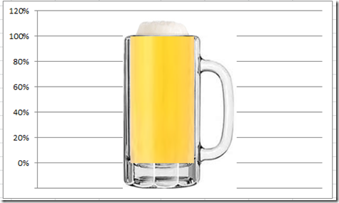
Change the numbers and see how the foam goes away and how it rises above the mug.
You can use this technique to create many different kinds of company goal charts. And they update dynamically when you change the current level without drawing shapes or other objects.
Now if you want to see it in action, check out this Excel Beer Mug Company Goal Video Tutorial.
Video Tutorial
Free Excel Dashboard Chart Template Download File:
Goal-chart-using-clip-art-beer-mug-column-chart.xlsx
If you like what you see, the please follow this 2 part equation:
1) Please tell a friend. Send them a link to this chart tutorial.
2) Please leave me a comment for other readers to know what you think. Thanks!
Steve=True

