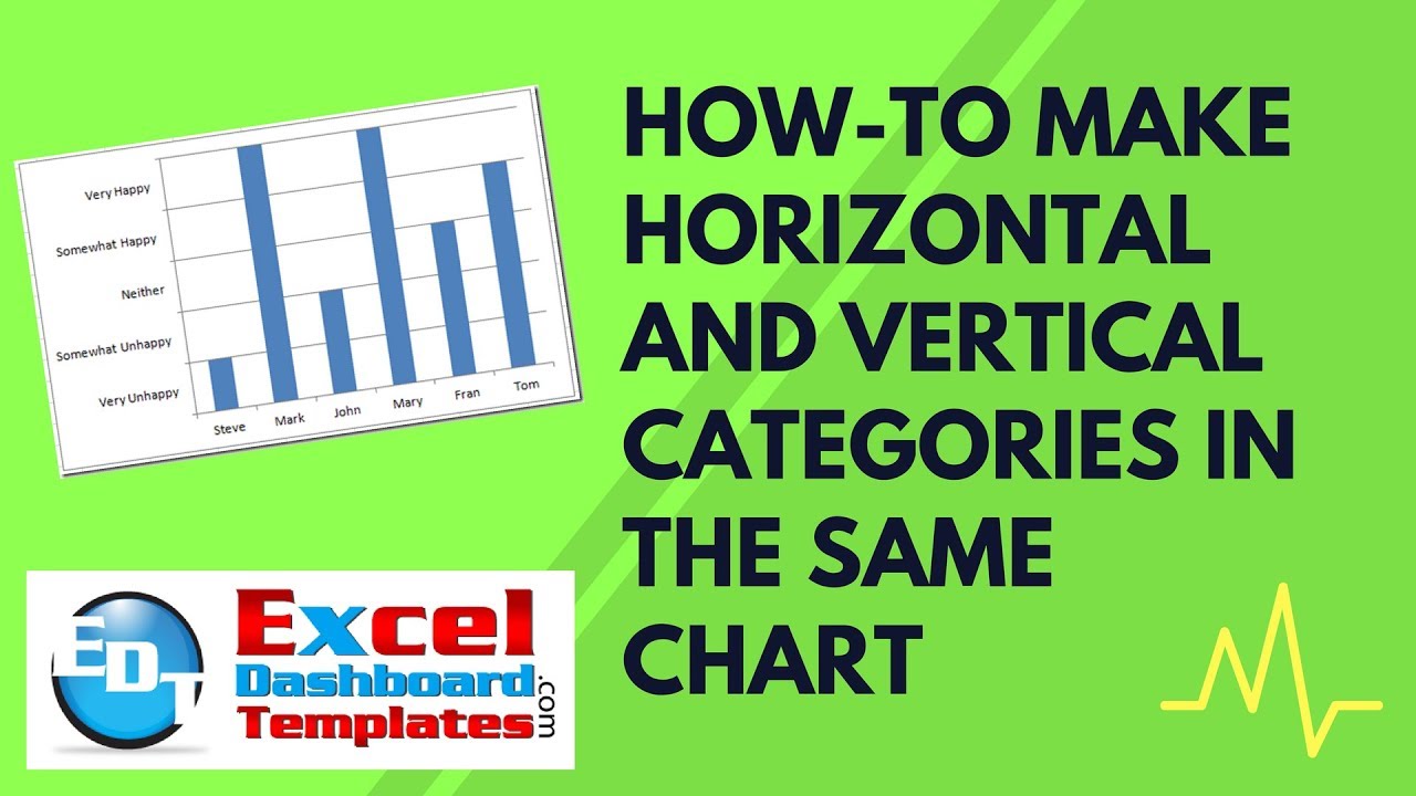
There are times in your Excel dashboard career that your boss will ask you to create an Excel Chart with category values for both your horizontal axis as well as the vertical axis. As you can see in this chart, there are no numbers in the vertical axis.

So how can we represent this in an Excel Dashboard Chart? Check out one method below:
1) Setup Data Range (for horizontal axis and data points) and Vertical Axis Categories Range

2) Chart Data Range

3) Copy Vertical Categories Range (but do NOT paste them yet, instead follow these steps

4) Select Chart

5) Paste Special and change to New Series

Your Excel Chart will now look like this:

6) Select the new series and change the chart type
Then choose Bar Chart

Now this is where your Excel chart will get psychedelic. Your new chart will look like this:
7) We need to add the Vertical Excel Categories in for the Horizontal bar chart. You can do this by inserting the Second Vertical Axis from the Layout Ribbon.

When you do this, it will start to look like what we want in our Excel Dashboard.
8) Now we need to move the Vertical Axis Categories to the left. You can do this by selecting the Second Horizontal Axis (the numbers on the top). After selecting the second horizontal axis, press your F1 key or right click on it and select Format Axis…

Then you want to check the box next to “Values in Reverse Order”
9) Now select the Primary Vertical Axis (the axis numbers on the left) and change the Minimum to Fixed 0 and Maximum to Fixed 5 and Major Unit to 1.0
10) Delete the Legend, the Upper (secondary) horizontal excel axis, and the Primary Vertical Axis (the numbers on the left. Your chart will now look like this:
11) Last step is to hide the red horizontal bars. We do this by right clicking on the red horizontal bars, and then clicking on Format Data Series… then choose the Fill Sub Menu and choose “No Fill”.

Your final chart will look like this:

Video Tutorial:
Please let me know how you can use this type of Vertical Text Category in your Next Excel Dashboard Template.
Steve=True


