In last Friday’s challenge, we had a Excel Analyst that needed to remove outliers from his Excel Line Chart. In essence, he wanted to go from this line chart: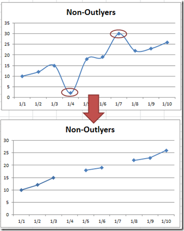
To this line chart. So in my last post, I showed you how to easily do this using the NA() Function in Excel. However, as you will find out, once you use the NA() Function in an Excel Line chart, the chart won’t put Gaps in the line. So what we did was to transform the data in cells A2:B11 to the cells E2:F11 and then chart that range.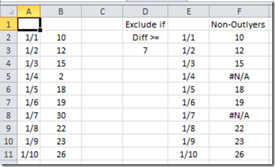
To learn more of the formula in cell F2:F11, check out this post and video:
How-to Eliminate Statistical Outliers in an Excel Line Chart
So in the last post, when you make an Excel Line chart of the range E2:F11, then your final chart looks like this: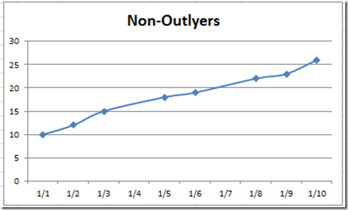
Notice that the points are connected when using the Excel NA() Function. It is very very close to what we wanted. But the true chart we wanted was to show the line chart with Gaps.
Now an EXCEL HERO of mine is Andy Pope. Andy is the Excel Chart O.G.! His solution for this situation was awesome. What he did was to create the line chart, then when there is a break in the line, he would mask over the line breaks with additional white lines to create a “fake” gap or obscure the line using additional formulas. The masking solution was awesome, but it wasn’t perfect. I have found that it doesn’t work very well with the way that Excel 2007 and newer versions of Excel draws line charts. For some reason, the obscuring white line doesn’t quite cover the original blue line. It is smaller by about 1 pixel all around and so you can still see the ghost image of the original blue line and markers. See below.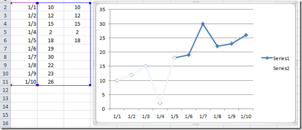
Maybe it worked better in Excel 2003, but seems to be slightly off in the newer versions of Excel. The only way to fix this particular issue is to increase the Line and Marker Width Size to about 4pt so that obscures the the line completely. Check it out here: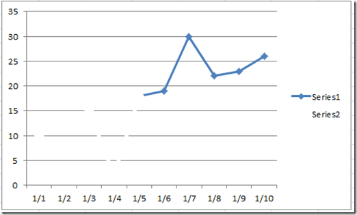
BUT, this causes additional problems. If you have additional lines in the chart or if you use grid lines, then this masking technique will also create gaps or holes in the grid lines. See above.
So how can we create a Line chart in Excel that using the NA() Function so that we can still show gaps in our line just as if we had deleted the data points? Well here is how ![]() .
.
Essentially, we need to create a formula that will create a line anytime it finds a numeric data point until it hits a #N/A value. Then we need an additional line for this same scenario until we have covered every point in our data set. Let’s walk through it.
The Breakdown
1) Make a Data Range that Uses the Excel NA() Function
2) Create Chart Data Range Formula
3) Copy and Paste Chart Data Range Formula for All Possible Combinations
4) Create Line Chart
5) Format Line Segments
6) Remove Chart Junk
Step-by-Step
1) Make a Data Range that Uses the Excel NA() Function
This first step is not too difficult. Typically, we use the NA() Function to hide data points that we don’t want to show. Excel will not show data points that equal #N/A. You can get this value by using the NA() function in your conditional formula. To learn more about the Excel NA() Function, check out this post:
How-to Hide a Zero Pie Chart Slice or Stacked Column Chart Section
So taking our previous post, we are using a data set that looks like this:
| A | B | C | D | E | F | |
|---|---|---|---|---|---|---|
| 1 | Exclude if | Non-Outlyers | ||||
| 2 | 1/1 | 10 | Diff >= | 1/1 | 10 | |
| 3 | 1/2 | 12 | 7 | 1/2 | 12 | |
| 4 | 1/3 | 15 | 1/3 | 15 | ||
| 5 | 1/4 | 2 | 1/4 | #N/A | ||
| 6 | 1/5 | 18 | 1/5 | 18 | ||
| 7 | 1/6 | 19 | 1/6 | 19 | ||
| 8 | 1/7 | 30 | 1/7 | #N/A | ||
| 9 | 1/8 | 22 | 1/8 | 22 | ||
| 10 | 1/9 | 23 | 1/9 | 23 | ||
| 11 | 1/10 | 26 | 1/10 | 26 |
To follow along, you can download the free excel line chart template file at the end of this article or you can open up a new spreadsheet and copy/paste the table above. Okay this is all we need to move on. We have 3 data groups that will make up our line with 2 break points designated by the #N/A values.
2) Create Chart Data Range Formula
Here is where all the Excel magic begins on how we will display gaps in our Line Chart when using the Excel NA() Formula. Based on our data above, we need to create the following formulas.
Cell H1 =A2
Cell I2 =IF(OR(COUNT($H2:H2)-1,ISNA($F2),AND(ISNA(I1),COUNT(I$1:I1))),NA(),$F2)
In Cell I2, we are just using an IF function. Lets take a closer look at this formula: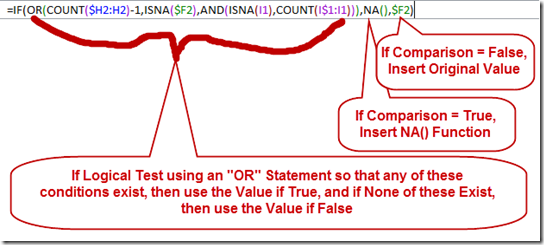
1) We start with an =IF Statement and if it is True then put in #N/A, ELSE if it is False, then put in the Data Point Value from column F.
2) The OR statement is where the power of our NA() Function shines. In the Logical Test using an “OR” Statement, if any of these conditions exist, then use the Value if True, and if None of these Exist, then use the Value if False. Lets look at each part of the OR function.
a) OR(COUNT($H6:H6)-1,
We are going to count all the values that are numbers starting from one cell left of the current cell. If the count is greater than zero (>0) then data point exists and our OR value will return “True”. Note, the minus one (-1) at the end of the count formula is to remove 1 from our count since we have a Date (which is a number) as our X-Axis categories. If your line does not have a date for the horizontal axis, then Remove the –1 from this formula. For instance, if you text like January, February, March, etc as your horizontal X-Axis then your formula would start out like this OR(COUNT($H6:H6),
b) ISNA($F6),
This is pretty straightforward. If our data point is already #N/A then we want our OR logical test to equal True
c) AND(ISNA(I5),COUNT(I$1:I5)))
This is the most complex part of the formula. Here is what it is doing. We are using a AND statement. We are using the AND statement because BOTH of these conditions must be TRUE in order for this component to be TRUE. If either part of this AND function is FALSE, then the entire AND statement is then FALSE.
Part 1: The first function of the AND is to see if the point above our current location is equal to #N/A. If so, then Part 1 = TRUE
AND
Part 2: If the Count of numbers above our current location is greater than zero (>0) then Part 2 = TRUE
In simpler terms, for the AND function, we want an #N/A if the point above is already #N/A and if there are already data points above. This indicates that this data point is beyond a break in our line and we shouldn’t plot it here.
3) Copy and Paste Chart Data Range Formula for All Possible Combinations
Now we only have our formulas set up, but now we need to copy them as follows:
a) Highlight H2:I2 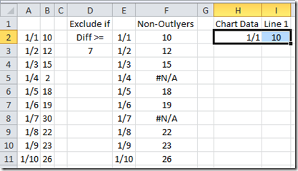 and copy/paste these values down to the last data point:
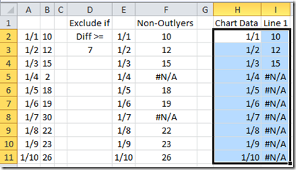
Now look at the data above. It is showing only our first 3 data points that will make up our first line segment using NA() function and then every data point below that segment will equal #N/A and will not be plotted in our Excel Line Chart.
b) Now highlight I1:I11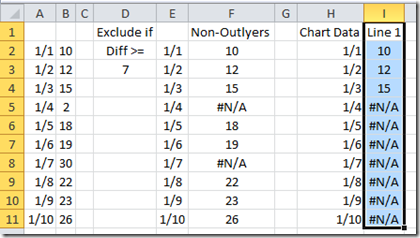 and copy/paste these values to the Right. Now we only need to copy to the right for 1/2 as many possible data points in our total data set. This is because the most possible line segments we would have would be 1/2 as many as our total because 2 data points make up a line segment and if every other data point was #N/A then we would also be covered because the chart would just show individual data points and not a line. So in our case, we have 10 possible data points, so we need a total of 5 line segments. So copy/paste the line 1 selection for 4 more columns of data. If you use the fill handle at the bottom right of your select, it will even take care of your line header. Your data range will now look like this:
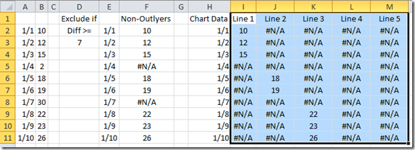
Notice that our Non-Outlier data has 3 line segments separated by the #N/A and our final data has the same line segments as well wrapped around #N/A. That way it will only display the part to the line that we want. This will also therefore, not hide gridlines nor will it hide other data series like the masking technique I described above. If I change my outlier value to 9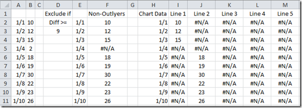
Then our formulas change and only create 2 line segment. If I manually change every other value to =NA() then our new chart data range will just show individual data points like this: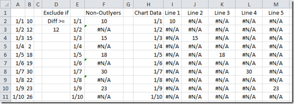
Looks like we are all set to make our line chart.
4) Create Line Chart
Okay to create our line chart, we are going to use the data in our Chart Data area. So highlight the range of H1:M11: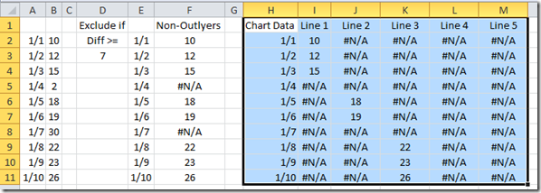
Then go to your Insert Ribbon and Choose the Line Button and then the Line with Markers Excel chart type: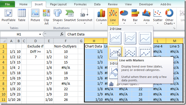
Your chart should now look like this: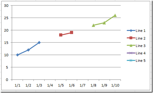
Pretty close to what we wanted, but each line has a different marker and a different line color. So let’s fix that in the next step.
5) Format Line Segments
Okay, click on the middle line segment (red one with square line markers). Then press CRTL+1 keys to bring up the Format Data Series dialog box. Then change
a) Marker Options to Built-In Diamond: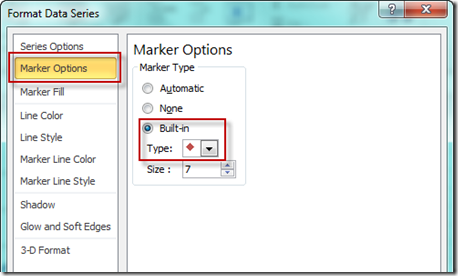
b) Marker Fill to Solid Fill and a Color of Blue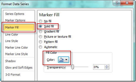
c) Line Color to Solid Fill and a Color of Blue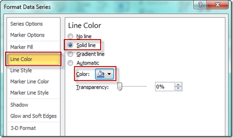
d) Marker Line Color to Solid Line and a Color of Blue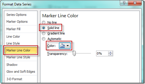
Your chart should now look like this: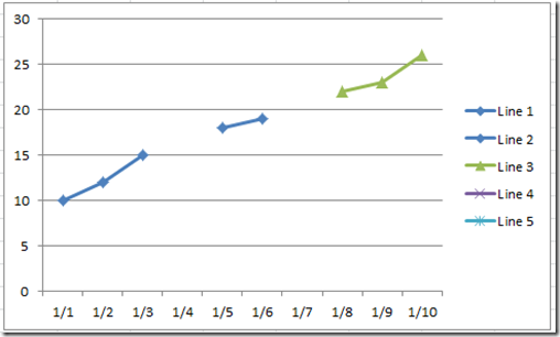
Now repeat these steps for both the visible and non-visible line segments. That way as your data changes, it looks like one line that is broken with gaps.
6) Remove Chart Junk
Now all we need to do is to select our chart and then select the legend.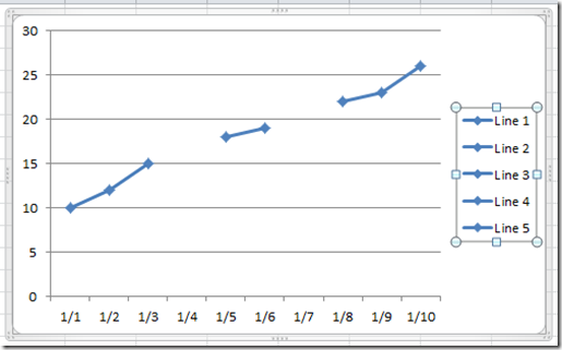
Then press your delete key and your final chart should now look like this: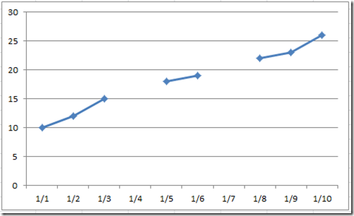
That is a pretty cool technique to create a line chart with gaps when using the NA() function.
Video Tutorial
Here is a step-by-step video demonstration of creating this line gap:
Free Excel Template File Download
You can see exactly how I did this and try it for yourself with this Free Excel File with this Line Gap formula:
https://www.exceldashboardtemplates.com/Show-Line-Chart-Gaps-Using-NA-Function
Thank you Andy Pope for all your contributions to Excel users and Excel Charting! Hopefully, I can do as much as you have.
Let me know if you think you can use this in your Excel Dashboard Charts in the comments below. Also, don’t forget to subscribe to the email list so that you get the next post delivered directly to your inbox.
Steve=True


