Twitter
Dashboard School
Consulting Services
Subscribe
Subscribe
Update Profile
Unsubscribe
Donate
Search
Search
Excel Dashboard Templates
Dashboard School
Consulting Services
Subscribe
Subscribe
Update Profile
Unsubscribe
Donate
Search
Home
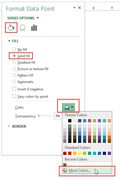
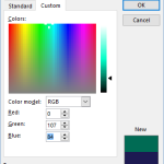
How-to Add Specific RGB or HSL Colors in Your Company Chart or Dashboard
Add More Colors to an Excel Chart Data Point
Add More Colors to an Excel Chart Data Point
Want to Receive the Next Post?
Join My Newsletter
Email
I agree to the privacy policy and terms.
Subscribe
Give it a try, you can unsubscribe anytime.
Privacy Policy
Close
Subscribe Now!
(
Privacy Policy
)
Email
I agree to the privacy policy and terms.
SUBSCRIBE
Stay Connected!
Get the latest post emailed straight to your inbox!
(
Privacy Policy
)
Email
I agree to the privacy policy and terms.
SUBSCRIBE