Why is Excel Overlapping Columns in this chart? Why EXCEL, WHY are you doing this??? I don’t understand. Have you ever asked yourself this question when Excel overlaps the columns you just moved a series to the Secondary Axis?
Well here is my take and a “potential” answer.
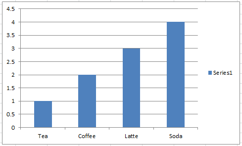
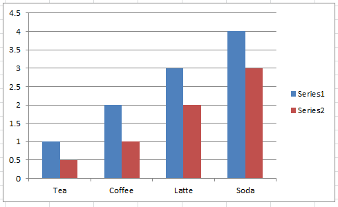
When using an Excel Column Chart, Excel will place those columns in the center of the category for every label in your horizontal axis. If there are 2 series, then it places them in the center and moves each to the right and left of the center of the category. It will keep everything in the center.
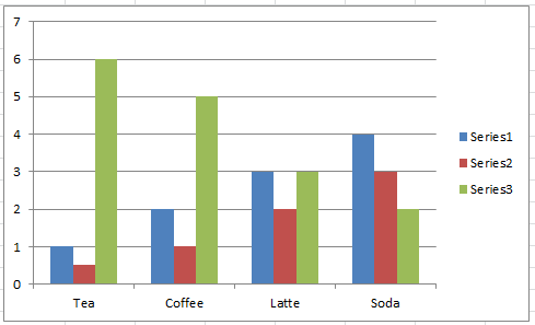
If you add a 3rd series, notice that it keeps them centered.
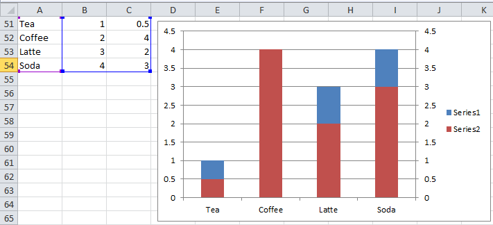
So when you move one of those columns to the secondary axis what happens? As you can see here, I have moved series 2 to the secondary axis and Excel Overlapping Columns are now causing me problems.
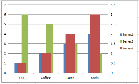
Excel will begin to center them again but this time you only have one column of data on each axis, so they will overlap.
WHY IS EXCEL doing this?
I imagine that the engineers designed the column charts around a line chart.
Notice how all the line markers are all showing on the center of the category label?
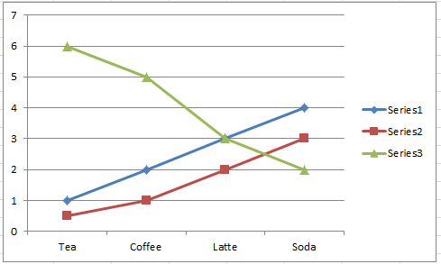
And if you move the one of the line charts to the secondary axis, your lines will overlap.
But that is not good enough! This is not a line chart, right? Well understandable. Perhaps there should be a chart option for column charts that you can choose that will not overlap the columns when you move them to the secondary axis. However, if this was an option, how would Excel handle this? Should the secondary axis graph be shifted to the right? Or perhaps it should be shifted to the left? That doesn’t seem like a problem right?
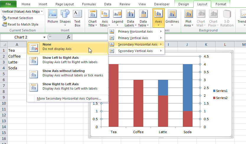
When you move a series to the secondary technically axis, you don’t have to have the same category labels. In fact, there is a hidden horizontal secondary axis that is not shown by default.
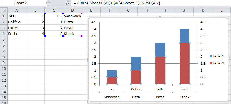
So what if the categories are different? Should Excel still move some of the columns to the right and some to the left so that they don’t overlap? That might seem strange as your category labels will no longer be centered but have to be off to one side or the other.
Remember, a column and line chart and graph is NOT an XY Scatter chart. Each category can be as small as one or very large. I think Excel is just making sure that all the categories are lined up in the center and the application is working as design.
Maybe I am wrong. Let me know in the comments below.
Do you need help fixing this issue in your Excel Chart, check out this post:
Stop Excel From Overlapping the Columns When Moving a Data Series to the Secondary Axis
Stopping Excel Pivot Chart Columns from Overlapping When Moving Data Series to the Second Axis
Steve=True


