In a previous post I showed you how to make an Excel Sales Funnel Chart or Sales Pipeline Chart, but it is a little trickier to create this graph in Excel 2013.
You can read that post and see a video demonstration here:
How-to Make a Sales Pipeline Funnel Excel Chart Template
The real issue or trick in doing this in Excel 2013 is in finding the Pyramid chart type.
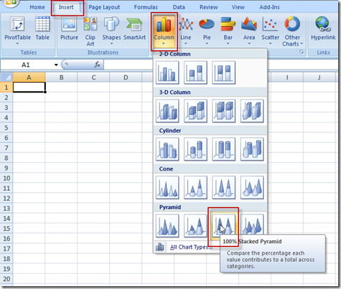
In Excel 2007 and Excel 2010, you had the Pyramid Chart type directly in the Column button on the ribbon.
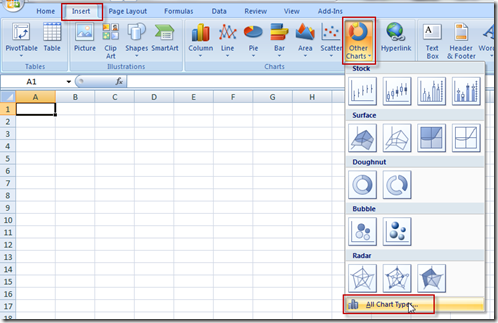
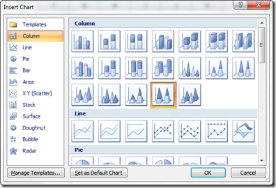
Or you could find it in the All Chart Types selection at the bottom of any of the chart buttons:
But in Excel 2013, it is not in the ribbon anymore.
Nor is it in the All Charts dialog box in Excel 2013.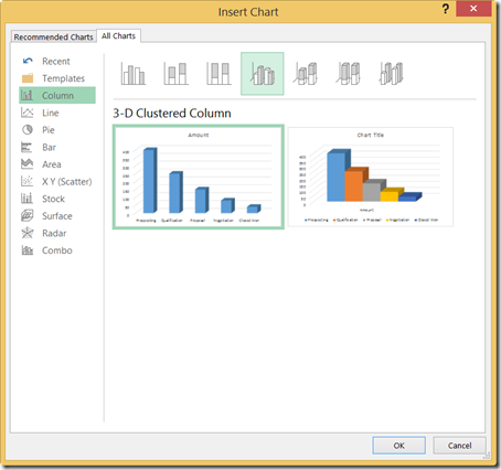
Instead, to create a Pyramid chart in Excel 2013, you must do the following steps.
1) Highlight your data range and Insert a normal 3-D Stacked Column Chart.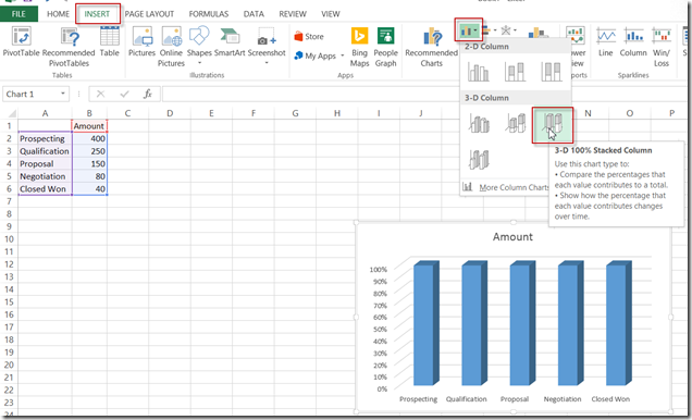
2) Then right click on any of the data series (columns) and then select Format Data Series from the pop-up menu.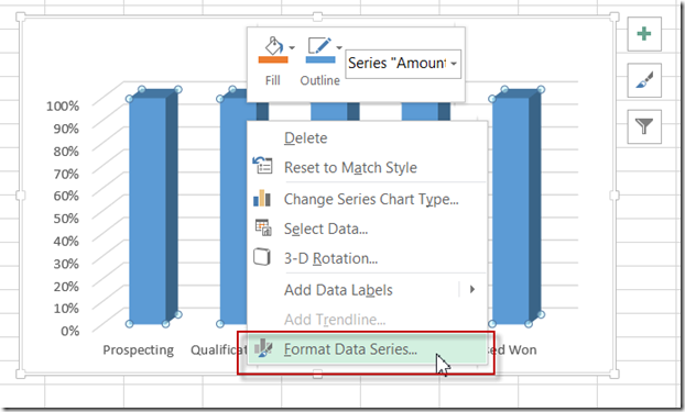
3) Then choose the Series Options toggle and then NOW you will finally see the Full Pyramid option. Choose this and then you are all set.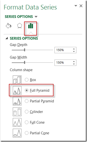
Hope this helps as you may already be using Excel 2013 for your next Excel Dashboard.
Here is a video showing you the exact steps for an entire Sales Funnel or Sales Pipeline chart in Excel 2013:
Thanks
Steve=True

