Well, I have been working hard on my project and it has successfully launched. But that took time away from my other passion, EXCEL!!!
So I started out a few weeks ago trying to make every chart in a USA Today. However, I lost that paper in my travels when the cleaning lady threw it away in my hotel. Oh well, lets do another one from a recent USA Today.
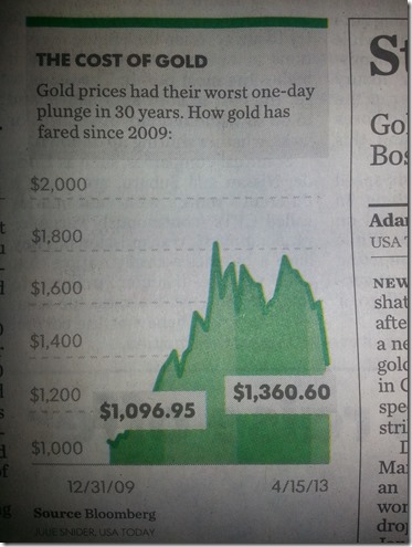
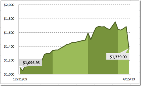
Here is a chart that I recently saw in the USA Today on one of the financial pages.
When studying this chart, I noticed a few things.
1) Looks like an Area Chart.
2) The Horizontal gridlines are dashes instead of the standard solid line.
3) There are special callouts that display the first and last value.
4) The horizontal axis is only displaying the first and last dates in the graph.
5) The area chart is highlighting each year in the graph with darker and lighter shades of green.
So can we recreate this infographic from USA Today with a standard Microsoft Excel chart without using Macros or without VBA?
Why of course, the answer is Yes ![]() (Silly rabbit – Trix are for Kids)
(Silly rabbit – Trix are for Kids)
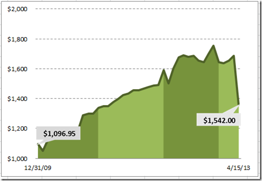
Here is my sample chart replicating the same USA Today Chart:
Looks the same to me (even though the data points are not exactly right, the format holds true)….…What do you think?
Okay, enough talk, lets get to making the Excel Chart.
The Breakdown
- 1) Set up your Chart Data Range
- 2) Create an Area Chart
- 3) Straighten out the highlighted Areas
4) Change the area chart Fill Colors
5) Change the Horizontal Gridlines
6) Set the Horizontal Axis
7) Set the Vertical Axis
8) Change the Line Series to a Line and Format the Line
9) Create the Shapes for the Custom Markers
10) Insert the Custom Markers into the Chart
11) Clean up the Chart Junk
Step-by-Step
1) Set up your Chart Data Range
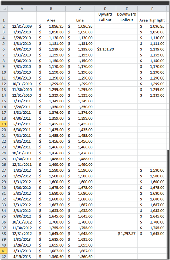
First we need to set up our data in a way that will help Microsoft Excel recognize the data in the way that we want to highlight it.
Lets take a look at each column.
Column A = Date Range for the horizontal or X-Axis
Column B = Data Range for the light green area chart
Column C = Data Range for the dark green Line at the top of the area graph
Column D = Data Range used to create the custom upward callout on the left of the USA Today Chart
Column E = Data Range used to create the custom downward callout on the right of the USA Today Chart
Column F = Data Range for the dark green area chart highlights
2) Create an Area Chart
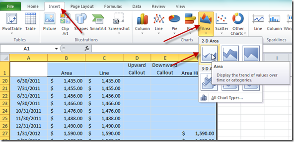
Now we need to highlight the range from A1:F42 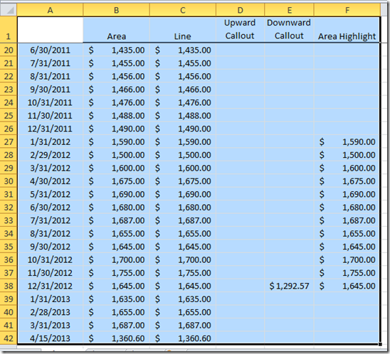
and then insert an Area Chart from the Insert Ribbon in Excel.
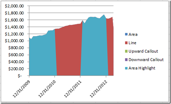
Your chart should now look like this:
Looks very close just from our chart data range, but not 100% match just yet.
3) Straighten out the highlighted Areas
Now you may notice that the blue highlighted areas are not quite vertical. There is just a slight slope left or right of them. That is because Excel is creating the area chart from the previous data point that is a zero and connecting it to the next data point (or vice versa). But we don’t want that. We want the data point to be a vertical point in conjunction with the zero area data point.
So how can we fix this? It is not too difficult, but we need to change a setting in Excel. It is not easy to find, but if you want a detailed explanation, check out this web post:
How-to Connect Gaps in a Line Chart in Excel
So to replicate this, right click on the the blue areas in the chart and select “Select Data…”: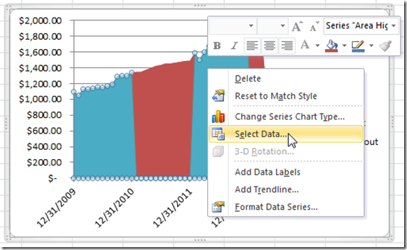
Then, click on the “Hidden and Empty Cells” button on the bottom left of the “Select Data Source” dialog box: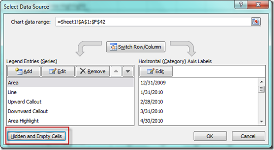
Then from the “Hidden and Empty Cell Settings” dialog box, you need to pick “Gaps” from the “Show empty cells as:” radio buttons: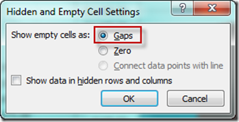
After you click okay 2 times, your chart should now look like this: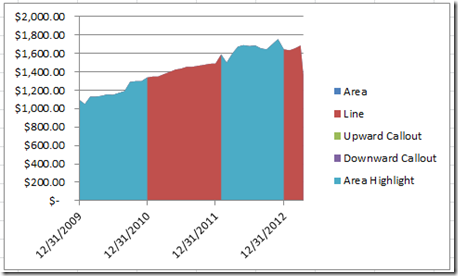
Notice how the blue shaded areas are now vertical as compared to the original chart?
If not, let me put them side by side.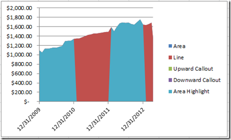

See the difference? I hope so, but it is very slight because we have so many data points. It becomes even more pronounced when you have fewer data points.
4) Change the area chart Fill Colors
Now lets make the area chart colors match what we wanted to see (green and dark green). You can do this by right clicking on the red area graphs and clicking on “Format Data Series…”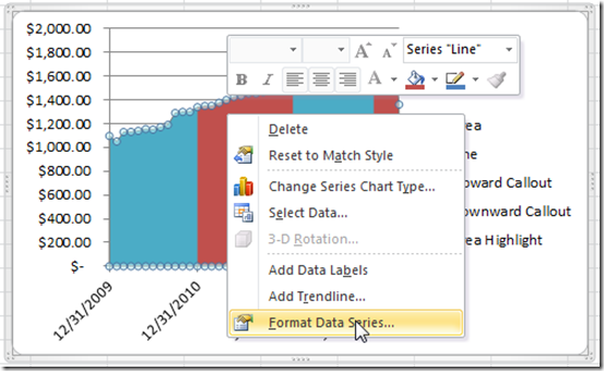
Then select Solid Fill from the Fill Menu and finally select an Olive Green Accent 3 color: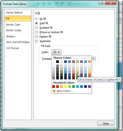
Your Excel Chart should now look like this: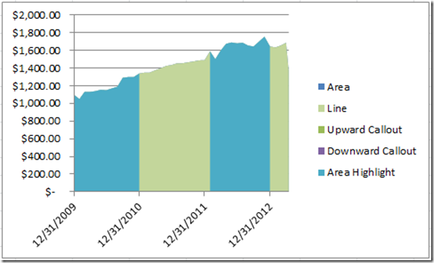
Now lets repeat the same steps for the Blue Area but this time, lets select one shade darker like this: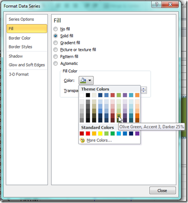
Your chart should now look like this: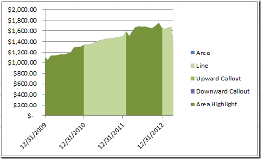
Getting a lot closer, but lets make it even better with the next few steps.
5) Change the Horizontal Gridlines
Right click on any of the horizontal gridlines and select “Format Gridlines” from the pop-up menu: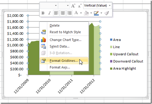
Then go to the “Line Style” section of the “Format Major Gridlines” dialog box and choose “Dash” from the “Dash Type” list: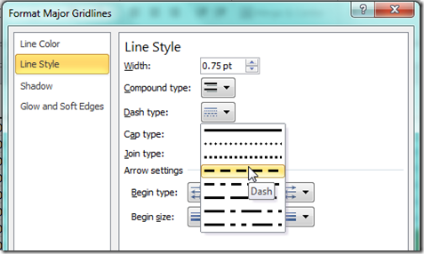
Your chart should now look like this: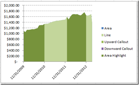
6) Set the Horizontal Axis
Now we need to change the horizontal axis to only show the first and the last axis categories and also change the format to “mm/dd/yy”
To do this, right click on the Horizontal Axis and then select the “Format Axis…” from the pop-up menu: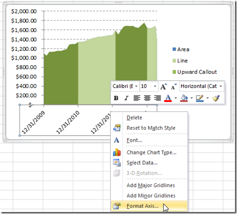
Now you will want to 1) Select “Text axis” in the “Axis Type”; 2) Change the “Specify interval unit:” to 40 and then change the “Major tick mark type:” to “None”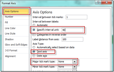
Then select the “Number” section in the “Format Axis” dialog boxy and then choose the “Date” from the “Category” selections and finally choose a date format of “mm/dd/yy” from the “Type” selections: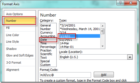
Your chart should now look like this: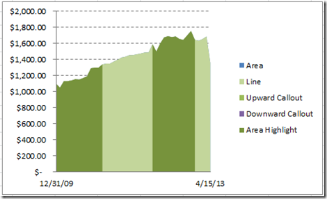
7) Set the Vertical Axis
Lets right click on the Excel Chart’s Vertical Axis and then choose “Format Axis…”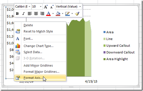
First we need to change the following settings on the “Axis Options” area: 1) Minimum=1000; 2) Maximum=2000; 3) Major Unit=200 and 4) Major Tick Mark Type = None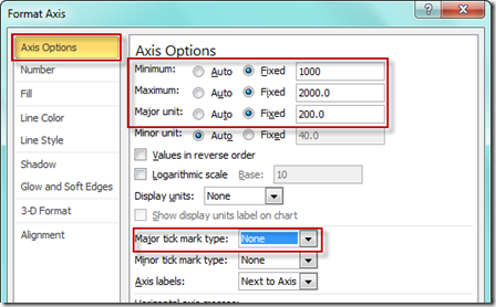
Then change the “Decimal places” to 0 from the Number area: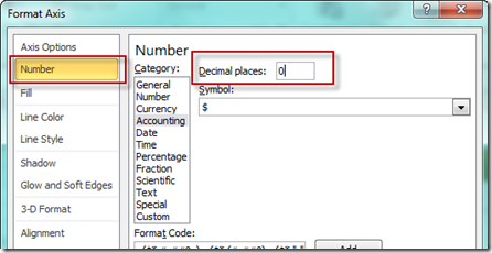
Your chart should now look like this: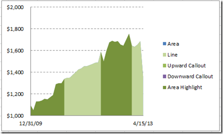
8) Change the Line Series to a Line and Format the Line
Now we want to highlight the top of the area by changing the Line series “Chart Type” to a Line Chart Type. First select the line series. If you can’t find it, check out this post:
How-to Select Data Series in an Excel Chart when they are Un-selectable?
Then go to the Design Ribbon and choose the “Change Chart Type” button:
Then select the left most Line Chart Type: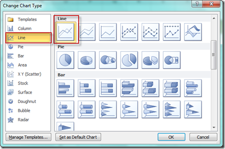
Your chart will now look like this: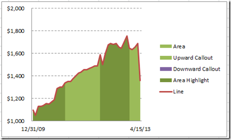
Now select the Line series and then press CTRL+1 to bring up the Format Data Series Dialog box and then change the Line Color to a Solid Line and then choose a Dark Olive Green: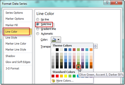
Your chart should now look like this: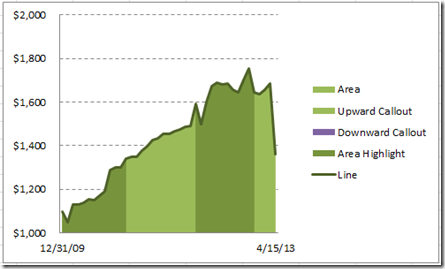
To make our next steps easier, we also need to change the Upward Callout series and the Downward Callout Series to Line Type charts as well.
See how the are now lines in the chart, but you can only see them in the legend because they have only one data point.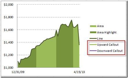
9) Create the Shapes for the Custom Markers
Wow, we are almost done but we need to add the Callouts.
You should check out this post if you want to learn more about these techniques:
How-to Make and Add Custom Markers in Excel Dashboard Charts
First we need to create the callouts from the Insert Menu in the Shapes button: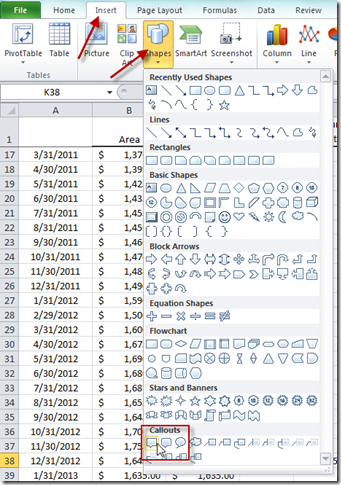
Insert 2 of the callouts anywhere into the spreadsheet and then press the “=” sign and then click on the cell for the first data point in your line series and then repeat this for the last data point for the other callout. You may have to drag and drop the call out pointer so that it is up for the last data point and down for the first data point.
To learn more about custom labels check out this post:
How-to Add Custom Labels that Dynamically Change in Excel Charts
Here are what my callouts look like:
10) Insert the Custom Markers into the Chart
To do this, we first need to copy the upward callout like you see on the left above. Then select your chart and select the Upward callout series. Then press CTRV+V to paste the callout as a custom marker. 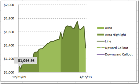
Repeat this for the right (downward callout) and the Downward Callout series.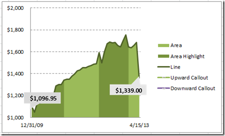
To learn more about this custom marker technique, check out this post:
How-to Make and Add Custom Markers in Excel Dashboard Charts
11) Clean up the Chart Junk
- The chart is looking great, just one quick thing to do. Clean up the junk. In this case, we just need to delete the legend.
- And then here is your final chart:
So we created this chart without overlaying any text boxes or images. Just using standard Excel charts.
Do you have a chart you want to see? Send me a note. Also, here is the same technique demonstrated completely in a video format.
Video Tutorial
Check out the video on YouTube at this link: http://youtu.be/hYwB1L4VigY
If you liked this chart, don’t forget to sign up for my blog and youtube channel so that you get the latest posts as well as the latest videos.
Steve=True

