As my lovely wife recently stated, Excel Radar Charts are COOL! I kind of agree.
That is why when I recently saw an Excel question posted in a forum it peaked my interest. The user wanted to know how he could remove the Zero that appeared by default as one of the radar rings / radar bands. This is what I mean. See the Zero that shows up when you create an Excel Radar Chart?
Well this user’s client wanted a chart that ranged from 1 to 5. Not zero to 5.
The Breakdown:
1) Setup Your Data and Create a Radar Chart
2) Remove the Zero with Custom Number Formatting the Vertical Axis
3) Understand More About Custom Number Formats
4) Taking it to the Next Level
Step-By-Step
1) Setup your data and create the radar chart.
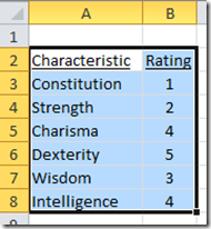
Type in and then highlight the range of data as you see above (from cell A2:B8) and then from the Insert Ribbon, insert a Radar Chart from the Other Charts button: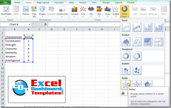
The Excel chart you have created should now look like this:
2) Remove the Zero with Custom Number Formatting the Vertical Axis.
Although it is not perfect nor completely customizable, Excel does provide some options to change the way that you can format how numbers are displayed. That is how we will fix this problem. I suggested that the user click on the chart and then right click on the Vertical Axis and then pick “Format Axis… from the pop up menu: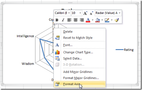
You will then see the Format Axis dialog box and you should now choose the Number selection on the left: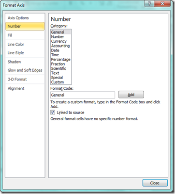
You should now choose the “Category:” of Custom and type this in the “Format Code:” box
#,##0;-#,##0;; (NOTE: notice the 2 semicolons at the right of the last zero. Don’t forget these.)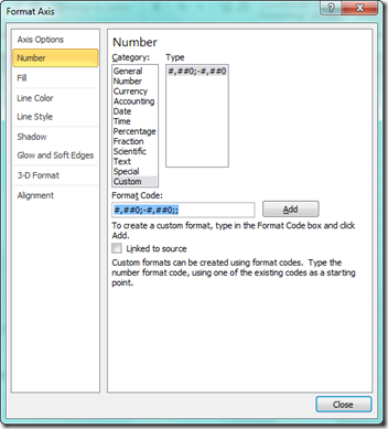
and then press the Add key and then the Close button.
Your chart should now look like this:
Notice that the Zero is now gone from the radar chart band numbers. That was it. Easy fix, but could have driven the user mad in trying to fix it. If this is a new concept for you, you should keep reading for more about how number formats work.
3) Understand More About Custom Number Formats
Number formats have 4 sections of code, separated by semicolons.
<POSITIVE>;<NEGATIVE>;<ZERO>;<TEXT>
So if we look closer at the custom number format we put in the Excel chart:
The first “#,##0;” tells Excel how to treat and format positive value
The next “-#,##0;” tells Excel how to treat and format negative value
And the final “;;” tells Excel how to treat and format any Zero value. In our case, we don’t want Excel to show anything (essentially hiding the zero) so I have left the Zero area of my custom number format blank.
Finally, I don’t care about text values, so I also left the final custom format section blank as well.
Isn’t Excel COOL? I think so ![]()
4) Taking it to the Next Level
I am so glad you decided to read on!!!! If you had not read this section, then you wouldn’t have learned this other cool Excel tip and trick that will make this Excel Chart look AWESOME!
I got to thinking and it occurred to me, why just hide the Vertical Axis value of zero. Why don’t we hide the entire chart area or maybe I should say chart gridlines that meet at the zero value?
Well that got me thinking, how can we do this? And it reminded me of another posting that I did:
How-to Highlight or Color Rings in an Excel Radar Chart
So I took those same concepts and created the following chart that makes it look like you are hiding the center point and Radar Chart Web Lines:
Here is how I did this, but please check out the Video Tutorial to see the steps in more detail.
1) Add a New Series with the Value of 0.5 that is right in the middle of the range you want to hide. In our case, since we are hiding the area in the middle of the 0.0 point to the 1.0 point, we need to create a new series with a value of 0.5.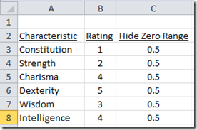
2) Change the Line Color of the new series to white. This is how we will hide the black gridlines, by covering them up with a white series.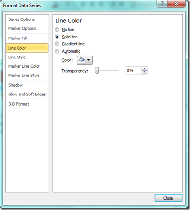
3) Increase the Line Style Width of the new series until it fills the space to your liking. It will not be perfect but should do the trick. Also, be WARNED that if you make the chart size bigger, you will need to adjust the Line Style Size to cover up the amount of pixels that are now showing in your chart for the zero point gridlines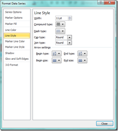
And your chart will look like this: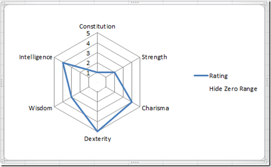
Video Tutorial
You can see a demonstration of both techniques here:
What other cool tips and tricks do you need help with in your Excel Dashboard Components?
Let me know in the comments (note that dude to spam, I will approve your comment and respond but it will not appear when you hit submit)
Steve=True

