Every time and I mean EVERY TIME that I go to create a Candle Stick Stock Chart in Excel (otherwise known as an Open-High-Low-Close graph) I run into an error. It is very frustrating as it seems as though the chart type is incredibly difficult to use.
Highlight your Excel Candle Stick Chart Data and Go to the Insert Ribbon and Choose Other Charts. Then choose the Open-High-Low-Close chart:
If you don’t do it just right, you will get an error and not a chart. Here is what the Excel error looks like: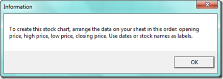
Have you run into this problem and didn’t know what you are doing wrong?
Well it was the bane of my existence when using Stock Charts in Excel. They don’t seem to act like any other charts in Excel, and the help didn’t seem helpful. Also, the error you see above didn’t really do it for me (in an explaining my issues sort of way. But then I figured out my problem.
This Excel stock chart MUST and I repeat MUST be formatted in a very specific way. That includes labels and dates. Most other chart and graphs in Excel do NOT have this limitations. And if you get it wrong, you can re-map the data to correct the problem. But not with an Open-High-Low-Close Candle Stick Stock Chart in Excel. You must be perfect from the start. NO EXCEPTIONS!!!
So lets see what I mean with this Excel Chart Candle Stick chart type.
If you make the chart right, here is what it will look like: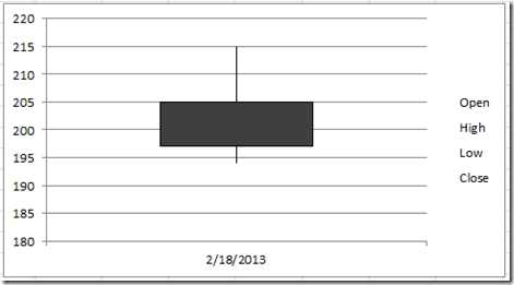
The very top of the vertical line is the High, the bottom of vertical line is the Low. Since the rectangle is in black, it means that the prices opened higher than it closed (i.e. the stock closed down). The top of the rectangle was the open and the bottom of the rectangle was the close. If the rectangle was white, it would be an up day and the open and close would be reversed.
Before we learn the right way to set up the data for a Candle Stick (Open-High-Low-Close) Excel Chart, lets first look at what will not work.
Here are all the ways that I tried to create the data, but I kept getting the charting error you saw at the top of the post: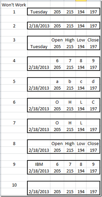
Lets look at why these stock charts don’t work:
1) No Stock Name, No Date, No Column Headers
2) No Stock Name, No Column Headers
3) No Stock Name, No Date
4) No Stock Name, Column Headers are Not Text (but numbers)
5) No Stock Name
6) No Stock Name (Case Sensitivity on Headers is not the Reason why)
7) No Stock Name, No Close Header
8) No Stock Name
9) Column Headers are Not Text (but numbers)
10) No Stock Name, No Column Headers
So, how do we have to format our Excel Candle Stick Stock Chart and Graph?
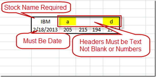
Here are how the standard Excel Candle Stick (Open-High-Low-Close) Stock Chart should be setup. Also, here are the details of each element that you must include in your data set for your graph: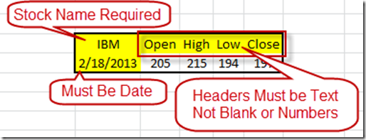
These elements are required. If you do not have these elements you will get this Error in Excel.
“To create this stock chart, arrange the data on your sheet in this order: opening price, high price, low price, closing price. Use dates or stock names as labels.”
Funny thing, when I kept playing with the Excel candle stick chart data set, I found that you actually do not need to put any label in the middle label area. You only need to put a beginning and ending label.
Here is the Excel chart that this would produce.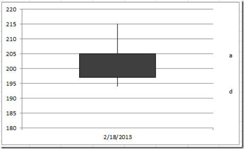
How funny is that. A requirement is not really a requirement in an Excel Stock Chart. LOL ![]() .
.
Oh well, now you know. Try it out and see.
Video Demonstration:
Here is a video showing you the right and wrong ways to make an Excel Stock Chart: http://youtu.be/Ev41mgnuz-c
Have you had these same frustrations? Did you know this? How often do you use an Excel Candle Stick Stock Chart? Let me know in the comments.
Steve=True

