In my last post I asked how you would create a chart for this request:
Presenting Metrics Data
Trying to find the best way to display some metrics and am coming up with a blank as I need to provide business metrics data for number of calls data and preferably with Excel 2010.
Initial thought was to create a line graph with points and hyperlink the points to the sub-topics but can’t figure out how to do that, then I thought about a bar graph with different layers to it as to each sub-topic with no such luck.
Example below:
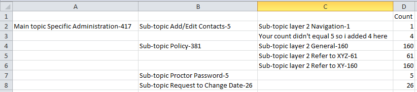
Specific Administration is the overall topic with a total of 417 for all other categories with “Add/Edit Contacts, Policy, Proctor Password, Request to Change Data” all falling under Specific Administration.
Then Navigation falls under Add/Edit Contacts, and General, Refer to XYZ, Refer to XY all falling under Policy and of the 381 stats for Policy is broken down by those and so I need to put that information with the sub-topic but not all sub-topics will have a sub-topic layer 2Here is the sample the user provided
So here is what I did.
I set up my data in Excel like this:
and it created a chart that looked like this:


It is using multilevel categories for the horizontal axis.
You can learn more about this technique here:
How-to Easily Create a Stacked Clustered Column Chart in Excel
You can check out the tips and tricks to make this chart happen in this video tutorial and demonstration:
Let me know if you would have chosen a different solution for this Excel Dashboard chart in the comments below. Also, don’t forget to subscribe to the blog!
Steve=True


