Here is another response that I received from Don for our recent Friday Challenge:
Friday Pipeline Usage Challenge
Since we weren’t sure from the client if the pipeline usage had to remain in distinct units, Don chose to sum the pipeline values and chart that range.
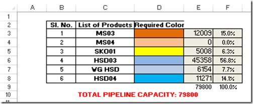
Here Don put the total values of all the pipeline usage next to the original color values:
He did this with a SumIF formula that was applied to the Current Pipeline Status values:
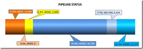
He then charted C3:C6 and E3:E6 in a stacked bar chart as you see here:
 Also, using the features of 2013, Don added labels from a spreadsheet range to add the % (Percentage) of usage.
You can learn more about that tutorial here:
Use Custom Data Labels from a Spreadsheet Range – Excel 2013
How-to Add Custom Labels that Dynamically Change in Excel Charts – Excel 2007-2010
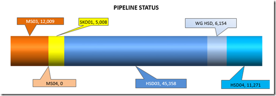
If you don’t include these values here is what the chart would look like in versions prior to Excel 2013.
You can download Don’s Creation here:
Dons Excel 2013 Pipeline Status Challenge Version
Dons Excel 2007-2010 Pipeline Status Challenge Version
Steve=True


