In a recent forum post, a dashboard user was asking how they can turn a decimal like 1.5 out of a 3.0 possible into a pie chart using Excel. This specifics for the data range and chart design would be as follows: “the ratings are 0 to 3 and three would be the entire pie and 1.5 would be half of a pie.”
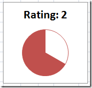
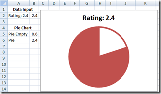
So here is the Pie Chart Solution that I Created in Excel: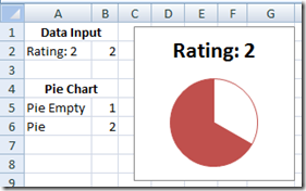
The Breakdown
Let’s walk through a few of the features of this chart.
1) Input your data point in cell B2
2) Chart dynamically changes the pie slices in cells B5 to B6.
3) The chart also adds the current rating to the Chart Title.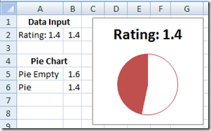
If you want more information about making a Dynamic Chart Title, please go to this link: https://www.exceldashboardtemplates.com/?p=1093. This post also includes step-by-step instructions and a video tutorial.
Step-by-Step Tutorial
1) Enter your current rating in cell B2. In our case, lets put in 2 so that it will look like the chart at the top of this posting.
2) In cell B5, put in this formula: =3-B2
3) In cell B6, put in this formula: =3-B5 This will be so that the total is equal to our total rating of 3.
4) Chart Cells A5:B6 and make your Excel pie chart. Here is what your pie chart will look like: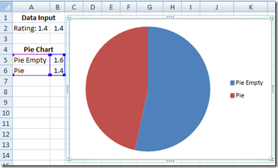
5) Now right click on the pie chart slice for the “Pie Empty” data series and select Format Data Series. Then, select Border Color and change it to the same color as your “Pie” slice. Your chart will now look like this (Note, I have increased the size of the border so that you can see it more clearly in this pie picture):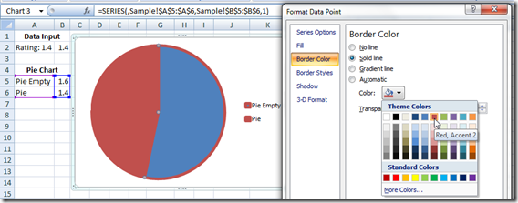
6) Then left click on the “Pie Empty” pie slice to make sure you are just selecting the data point, Not the entire pie series. Then right click on the pie slice “Pie Empty” and select Format Data Series and then select Fill and change it to NO FILL. Make sure that you Your chart will now look like this: 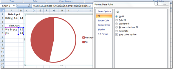
7) Now click on the legend and then press your delete key to remove the legend.
8) In cell A2, create this formula: =”Rating: “&B2 This will be used for the Chart Title.
9) Now add a chart title and link it to cell A2 [To make your chart title change dynamically (equal to A2), check out this: How-to Make an Excel Chart Title Change Dynamically-https://www.exceldashboardtemplates.com/?p=1093)
Your final chart will now look like this:
Just what the CEO of your company was asking for in the next Executive Company Dashboard.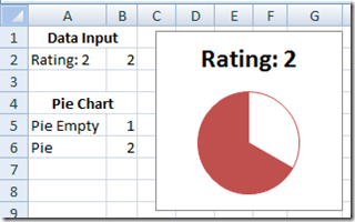
Now as you change the cell B2, it will change your chart for the current rating.
I hope this helps you with your next executive excel dashboard. Please let me know if you found this helpful and how you are going to use it in your next dashboard template in the comments below.
Free Download Dashboard Template
Excel-Pie-Chart-Rating-System.xlsx
Video Tutorial
Please don’t forget to Subscribe to my blog so you get the latest excel dashboard design information.
Steve=True

