Yesterday, I showed you how you can use the new label options in Excel 2013 to help Kevin with his engineering chart. But we didn’t quite complete the final chart and challenge that Kevin was after. So today we are going to get it one step closer.
Remember that Kevin wanted to add Text to his Excel Chart Data Table. But he couldn’t figure out how to do it. You can review the challenge here:
Friday Challenge – Showing More Categories in an Excel Chart
With this dataset,
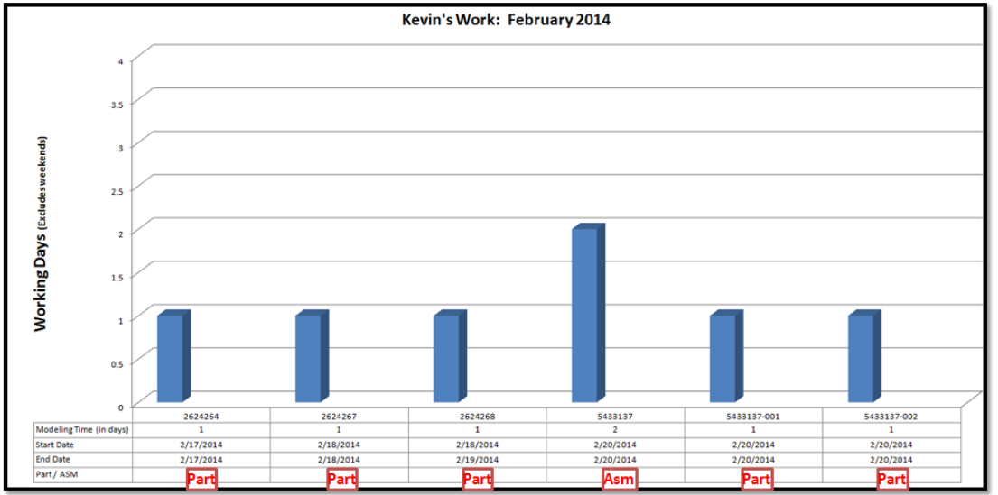
Here is what the final chart should look like with the data points being labeled as Part or Asm in the Data Table below the columns:
Okay, so I have to admit, that we can’t actually show text in the data table of an Excel Chart. The data table is for values of the data points that you see in the actual chart. You just can’t do it. However, it doesn’t mean that we can’t fake it in Excel.
As I see it, there are two options that we can do to put text into the data table and achieve what Kevin wanted in his chart.
1) Overlay your chart in the spreadsheet and make the spreadsheet data look like it is part of the chart. You have to match up the size of the columns in the Excel spreadsheet with the columns in the chart.
Here you see that I have copied and pasted the data in a transposed fashion into another part of the spreadsheet. I then created a chart and tried to match up the spreadsheet columns to the chart columns:

Trying to match up the columns in the spreadsheet to the columns in the chart are a pain in the butt to do in Excel and it is hard to get it perfect. Also, I had to do the following to make it look like it is one complete chart:
a) Set the Chart Area Fill = No Fill
b) Set the Chart Area Border = None
c) Set the Horizontal Axis Labels = None
d) Set the Fill color in cells A1:G14 = White
2) The other option to put Text into the Data Table in an Excel Chart is to fake the look of a data table.
We can do this by using the Horizontal Axis option of “Multi-level Category Labels”

Now if you aren’t seeing this as a Format Axis option in your Excel Column Chart then you need to pick at least two columns for your Axis Label Range. You can change your Axis Label Range by first selecting your chart, then go to the Design Ribbon. Then choose Select Data from the Data group. Then you will see this dialog box where you will want to select the Edit button on the right:

You will then get this dialog box. You will need to pick Two or More columns in your data range like you see here:

If we highlight all the data from A1:F7, then choose the Insert Ribbon and choose the 2-D Column Chart from the Chart Group. Your chart will now look like it has a Data Table without actually using the Excel Chart Data Table.

Notice that we were also able to put in the Text of Part or ASM in the chart data table like Kevin wanted.
This is an easy solution to implement and can fake a data table in the chart so that we get the desired effect.
How do you use Data Tables in Excel Charts? Let me know in the comments below.
Video Tutorial
See both of these data table tips and trick in a video demonstration here:
Free Excel Dashboard File Download:
Fake-Excel-Chart-Data-Tables.xlsx
Now this isn’t a perfect solution, but I will push it one step farther in tomorrow’s posting, so come back then.
Steve=True


