There are times when you are creating your Excel Dashboard Design that you desire something that does not come naturally with the Excel Tools as designed. In those times you will need to come up with a solution using Excel Tips and Tricks. Here is a simple one that works for the following scenario.
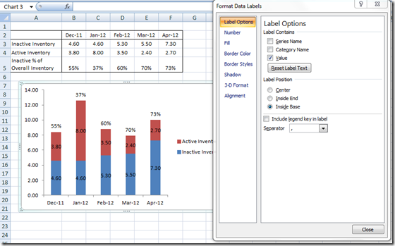
The user wanted to create an Excel Chart that has the following data:
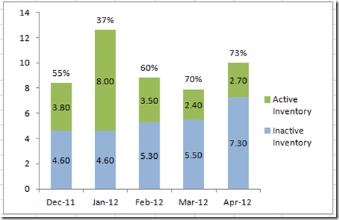
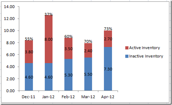
The specifics for the chart is that we need to have the Percentages at the very top of a Stacked Column Chart. Here is what the final chart should look like:
The Breakdown
1) Highlight your Data and Categories from A2:F5 and create a 2-D Stacked Column Chart in Excel.
2) Add Labels to the Chart.
3) Here is the Excel Trick: Hide the inventory percentage stacked column by changing the fill to No Fill.
Step-by-Step
1) Create your Chart by highlighting the complete range of data and then go to your Insert Ribbon and then choose 2D Stacked Column Chart: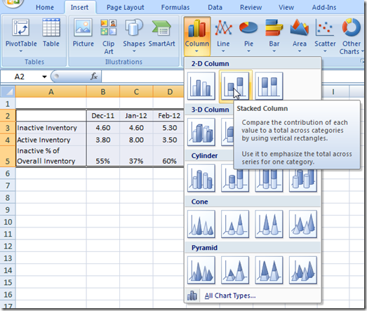
Your resulting chart will look like this: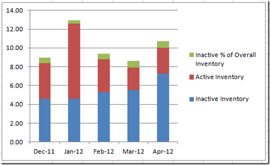
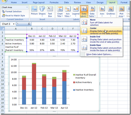
2) Next we need to Add Data Labels. First select your chart in the white area and then go to your Layout ribbon and choose Data Labels and then Center.
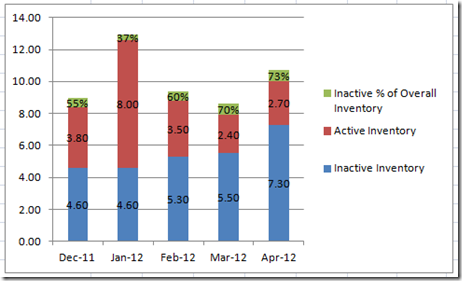
Your resulting chart will look like this:
3) Now we need to select the “Inactive % of Overall Inventory” data series in the Excel Chart.
Since the percentages cover up most of the data series columns, it might be best to select the data series with an alternate approach to clicking on the data series with your mouse. You can read more about this technique in this post: How-to Select Data Series in an Excel Chart when they are Un-selectable?
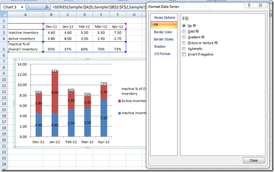
Once you have selected the data series, you should then change the fill color to NO FILL:
Then we need to change the fill color to No Fill. The Excel Graph is looking good.
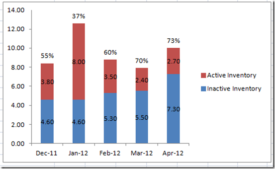
4) All we need to do is to Clean up Chart Junk. I would recommend deleting the horizontal gridlines and also the extra un needed legend item. The final chart would look like this:
Based on where you data labels end up, you may want to adjust the data label position of the percentage series to inside base.
This will make the labels look more uniform. This will make your final final chart look like this:
Add this Excel chart tip and trick to your bag of tricks and your next Excel Dashboard will be the talk of the town.
Video Tutorial
Hopefully this quick Excel Tip and Trick will help you in your Excel Dashboard Design. If so, please don’t forget to subscribe to my blog or RSS feed so that you can get the next post delivered right to your inbox.
Steve=True

