In a follow-up to my recent Terrible Chart Tuesday, I wanted to show you 2 different techniques that you can use to create a chart in Excel where the line goes up instead of down when you have negative values.
But first, check this out. Here is the original chart from the church bulletin showing the negative values going up: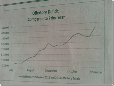 Now here is a recent bulletin of an updated chart that I just saw in the bulletin:
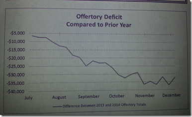 Do you think the church accountant is a fan of the website and changed the chart after the Terrible Chart Tuesday post? 🙂 Enough fun stuff, lets get to the tutorial. There is also a link to the video explanation at the end of the post and a free Excel file download.
There are 2 different ways to make the first chart where negative values go up instead of down. Both solutions are presented below and in the file and video.
The Breakdown (Solution 1)
1) Create Absolute Value Data Series
2) Create the Line Chart
3) Delete Negative Lines
4) Change Vertical Axis to Custom Format
Step-by-Step (Solution 1)
1) Create Absolute Value Data Series
For this solution, we need to create two helper columns of data. We do this with the Absolute Value function. The Absolute Value Function returns the positive value of any number. In the case of the –19 value in cell B3, the ABS(B3) = 19
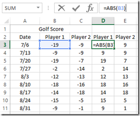 Repeat this step for all of your columns of data as you see in the picture above.
2) Create the Line Chart
Now that we have our data set, highlight cells A2:E11 and create a Line Chart from the Insert Ribbon.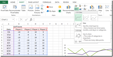 Your chart should now look like this:

3) Delete Negative Lines
To save time, it is sometimes easier to create a chart with too much data and then delete the data series that you don’t want. That is what we did here. So lets delete the values are are showing up as negative. You can do this by selecting the chart and then selecting either one of the negative series and then press your delete key. Repeat this step for the other negative data line.
Your chart should now look like this:
4) Change Vertical Axis to Custom Format
We are almost done. The only thing we need to fix is to make the vertical axis display a negative values instead of positive values. To do this, we need to create a custom number format for the vertical axis.
First select your chart, then click on the Vertical Axis and press CTRL+1 to bring up the Format Axis dialog box. Then choose the Custom Category from the Number section. Then in the Format Code box, add a negative sign ‘-‘ and press the Add button.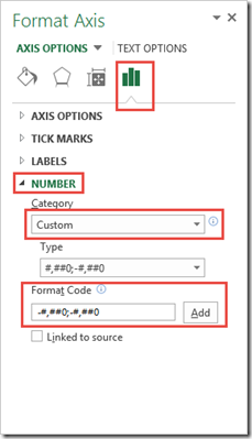
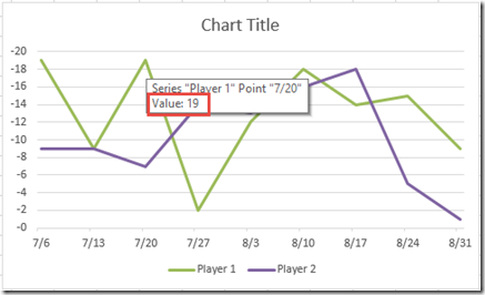
Your final chart should now look like this: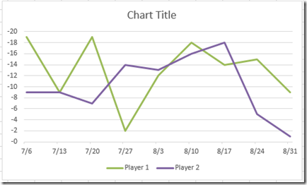 Now there is one problem with this solution. If you hover over any of the data points in the chart, Excel will display a positive value instead of a negative one.
The next solution solves this problem.
The Breakdown (Solution 2)
1) Create the Line Chart
2) Reverse the Order on the Vertical Axis Values
3) Change Horizontal Axis Label Position
Step-by-Step (Solution 2)
1) Create the Line Chart
In this solution, we don’t need to create any helper columns. Simply highlight and create a line chart from the Insert Ribbon.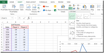
Your chart should now look like this: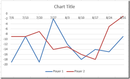
2) Reverse the Order on the Vertical Axis Values
This step will reverse our data so that we can display the more negative values on the top of the Excel chart.
To do this, click on the Vertical Axis and press CTRL+1 to bring up the format axis dialog box. The from the Axis Options, check the “Values in reverse order” option: 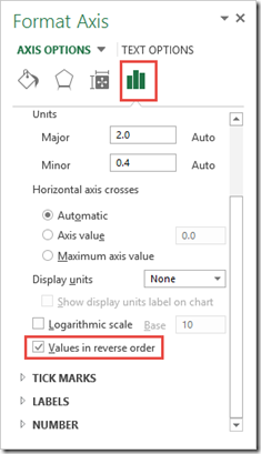 Your chart should now look like this:
 You will now see the more negative values appearing on the top of the chart as more negative you go to Par in Golf scores is better.
3) Change Horizontal Axis Label Position
We have one last step to do. Excel’s default for the horizontal axis has the data showing up above the Zero vertical value. In order to change this, first select your chart, then click on the Horizontal Axis and press CTRL+1 to launch the Format Axis dialog box. Then set your Axis Labels – Label Position to High. 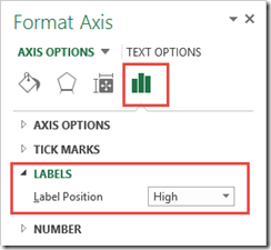 Your final chart should now look like this:
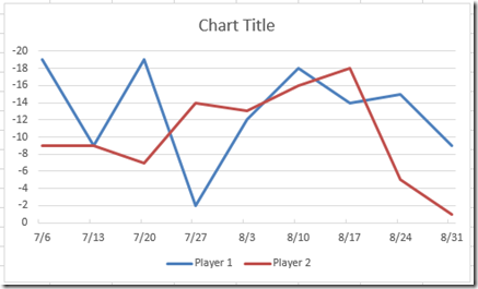
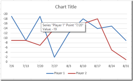
Besides having less steps, this chart version also fixes the hover over data points issue that the other solution had. I think it is superior.
Video Demonstration
Free Excel File Template Download
Excel-Negative-Value-Chart-Going-Up.xlsx
Which solution do you like better? Also, what other Negative Values are Good types of data are there? I am a golf fan, so that is my only sample. Let me know of other ones in the comments below.
Steve=True

