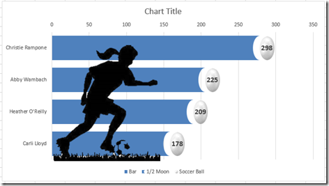
In a recent issue of USA Today, the following infographic was posted on the U.S. women’s national soccer team player appearances. 
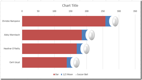
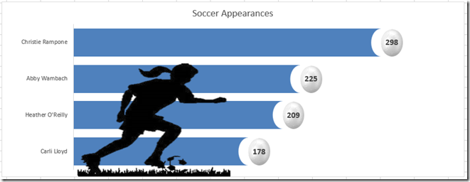
I liked it and wondered if I could make a similar chart using Microsoft Excel. Here is my take on the same chart using Excel 2013:
I like my chart better (but I am biased ![]() ). What do you think? Let me know in the comments below. My chart has a few really interesting techniques when it comes to shapes that you should check out below.
). What do you think? Let me know in the comments below. My chart has a few really interesting techniques when it comes to shapes that you should check out below.
The Breakdown
1) Create Rectangle and Circle Shapes
2) Modify Shapes in PowerPoint
3) Insert Soccer Ball Picture and Crop Soccer Ball
4) Remove Background of Soccer Player in PowerPoint
5) Build Chart Data Range
6) Create Stacked Bar Chart, Switch Rows/Columns, Delete the Appearance Series and Reverse the Vertical Axis
7) Replace Half Moon Series Modified Shape
8) Replace Soccer Ball Fill Series with Soccer Ball Picture
9) Copy and Paste Soccer Player into Chart
10) Change Bar Series Fill Colors
11) Insert Labels on Soccer Ball Series
12) Add Chart Title and Delete Grid Lines and Horizontal Axis
Step-by-Step
1) Create Rectangle and Circle Shapes
In order to make the half moon / rectangle shape that we use at the end of each bar, we need to create it. 
Now this shape doesn’t appear in the normal shape lists as far as I could see. So let’s create it on our own. To do this, we need to do the following:
a) Create a rectangle shape from the Insert Ribbon
b) Create a circle shape from the Insert Ribbon
c) Overlap the 2 shapes with the circle on top of the rectangle as you see here
2) Modify Shapes in PowerPoint
We have now created the basis for our half moon / rectangle shape, but we need to modify it using Microsoft PowerPoint features. We can do that as follows:
a) Highlight the rectangle and then hold down your shift key and then select the circle shape in Excel and press CTRL+C to copy the shapes to the clipboard
b) Open Microsoft PowerPoint and paste the shapes in a blank presentation document on any slide by pressing CTRL+V
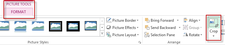
c) With the shapes selected, go to your Format Ribbon and choose the Merge Shapes button in the Insert Shapes group. Then choose “Subtract” from that menu.
d) Select the new shape we have just created in PowerPoint, copy it and paste it in Excel

3) Insert Soccer Ball Picture and Crop Soccer Ball
Our next step is to find a picture of a soccer ball with a white background. Then insert or copy that picture into your Excel workbook.

Now you will need to crop this picture so that the borders are as close to the picture as possible. To do this, select your picture, then go to the Format
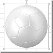
Then move in the crop lines as close to the soccer ball as possible.
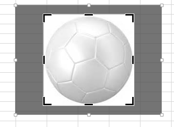
Then click away from the picture to make the crop take effect.
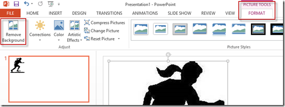
4) Remove Background of Soccer Player in PowerPoint
In my example, I found this picture that I wanted to use for my Soccer player.

This picture is great, but the background is not transparent. But we can also use Microsoft PowerPoint to help us with this issue.
a) Open PowerPoint and insert the soccer player picture or cut/paste the picture from Excel
b) Select your picture and then press the Remove Background from the Format Ribbon
c) Move the selectors to the edge of the graphic so that the entire picture is in the selection area
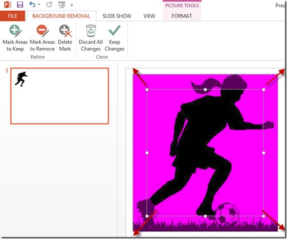
d) Press the Mark Areas to Remove button and select the background areas that you want to be transparent:
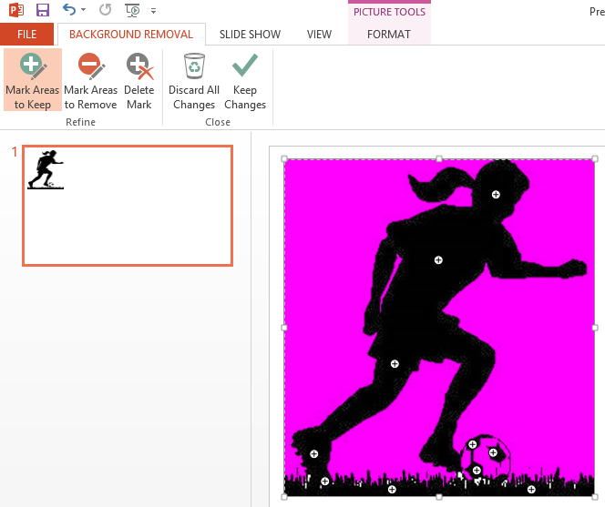
e) Then select the Mark Areas to Keep button and click on the player image in the foreground.
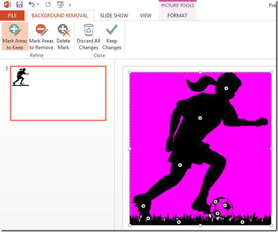
f) When you have selected both the colors to keep and the colors to remove,

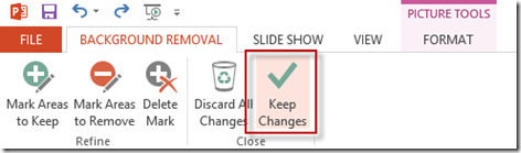
you can then press the Keep Changes button to remove the background of the image.
g) Copy and paste this image from PowerPoint to your Excel worksheet so that we can use it in a future step. Notice that the background is removed and you can see gridlines and our shape that are behind the soccer player image: 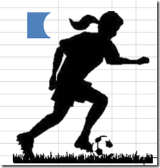
5) Build Chart Data Range
Finally, we can start to use Excel to build our chart.
We need to create 3 chart series to represent the following:
a) The bar on the left

b) The half moon / block shape
c) The Soccer Ball
To do this, set up your data like this:
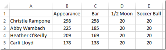
Column C contains this formula: =B2-D2-E2 (It is Column B minus Columns D and E so that we can make sure the actual size of the bars are accurate but leaves us room for our graphics).
Column D and E equal a value of 20. This is a matter of preference to make your soccer ball and half moon shape look realistic and not stretched or squished.
6) Create Stacked Bar Chart, Switch Rows/Columns, Delete the Appearance Series and Reverse the Vertical Axis
Let’s create your chart now by selecting the range of A1:E5 and then select the Stacked Bar Chart button from the Insert Ribbon
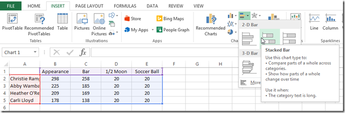
Your chart should now look like this:
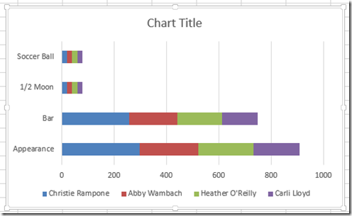
However, our chart has the wrong categories. To fix this, we need to select our chart, then press the Switch Rows/Columns button from the Design Ribbon. Your chart will now look like this:
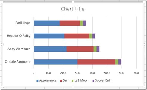
Also, we need to delete the Appearance series from the chart since we are just using it for a calculation and not a chart series. Simply select the Appearance data series and press your delete key. Your chart will now look like this:
The last part of creating our base chart is to reverse the vertical categories so that Christie Rampone is on top and Carli Lloyd on the bottom. Simply select the vertical axis, and press CTRL+1 and select the “Categories in Reverse Order” checkbox from the Format Axis dialog box
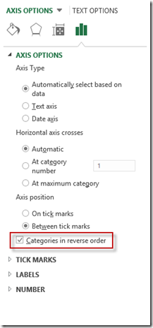
Your chart will now look like this:
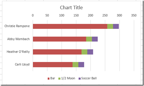
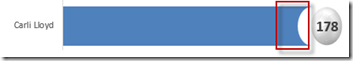
7) Replace Half Moon Series Modified Shape
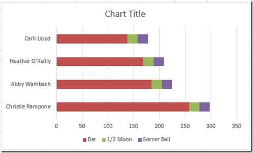
Now it is time to replace our 1/2 moon series with the 1/2 Moon / Block shape. Select it, then press CTRL+C to copy it

Then select the 1/2 moon series in the chart and press CTRL+V to paste it into the chart. Your Excel Chart will now look like this:
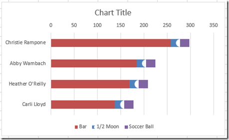
8) Replace Soccer Ball Fill Series with Soccer Ball Picture
This is a similar step of replacing the Soccerball series with our cropped soccer ball picture.
Select the cropped soccer ball picture, then press CTRL+C to copy it

Select the Soccer Ball series in the chart and press CTRL+V to paste it into the chart. Your Excel Chart will now look like this:
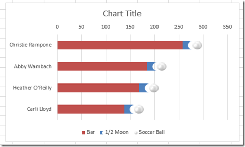
After this step, you may want to reduce the Gap Size of the stacked bar chart and/or stretch the overall chart size to get your desired chart look and shape format. Here is what mine looks like:
9) Copy and Paste Soccer Player into Chart
Now we want to overlay our women’s soccer player with the transparent background into the chart.
Select the soccer player picture with a transparent background, then press CTRL+C to copy it.
Then select the chart, and press CTRL+V to paste it into the chart. Your Excel Chart will now look like this:
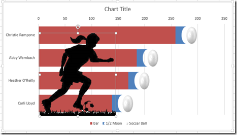
Position the soccer player where you like by selecting it and moving it with your mouse.
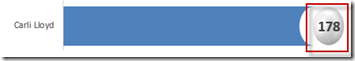
10) Change Bar Series Fill Colors
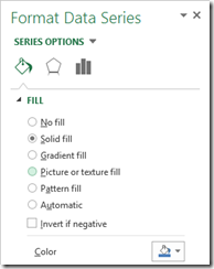
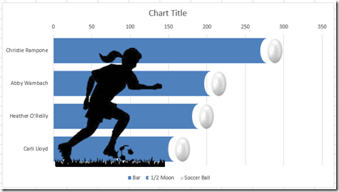
We now need to match the Bar series to the color in of the 1/2 Moon series shape. To do that, select the Bar Series and press CTRL+1 to bring up the Format Series Dialog box. Then change the Fill color to match the 1/2 moon shape color. In our case, it was a Blue Accent 1:
Your chart will now look like this:
11) Insert Labels on Soccer Ball Series
Adding data labels to the soccer ball is easiest to complete in Excel 2013. You can see how to do it in this post.
How-to Use Data Labels from a Range in an Excel Chart
If you don’t have Excel 2013, you can create data labels with this technique:
How-to Make Conditional Label Values in an Excel Stacked Column Chart
After adding your data labels, your chart should now look like this:
12) Add Chart Title and Delete Grid Lines and Horizontal Axis
Finally, you may want to clean up your chart by deleting the Grid Lines, deleting the legend, deleting the horizontal axis and add a chart Title. After doing these items, you may have to reposition the soccer player.
Here is what your final chart will look like:
Video Demonstration
Watch the video tutorial of all these techniques here:
File Download
Get the free file template here and try it yourself:
USA-Today-Soccer-Infographic-Chart.xlsx
Here are a few other Infographic style charts that I have created in Excel if you want more:
How-to Make a Beer Mug Goal Chart as an Excel Dashboard Component
How-to Make a USA Today Pie Chart Graph – Replicating All Charts in USA Today Part 1
USA Today Charts Part 2 – Excel Area Chart with Line and Area Highlights
How-to Make a WSJ Excel Pie Chart with Labels Both Inside and Outside
How-to Recreate a NYT InfoGraphic Mustache Grouping Chart in Excel
Also, let me know in the comments if you think you would use some of these shape techniques and also what you think of infographics vs charts.
Steve=True


