Last week, I posed a Friday Challenge that was posted in a Q&A for Excel. Here it is:
*****************************************************************
Plotting a line graph to track build health
I am looking for Execution Date on X axis ( which is not a problem) currently. But on Y axis I am looking to plat a Pass/Fail which is getting replaced with a 0/1 and the mapping is also not coming out fine. –Ash
| A | B | C | D | |
|---|---|---|---|---|
| 1 | Sr.No | Build No | Execution Date | Status |
| 2 | 1 | 1 | 8-Aug-13 | Pass |
| 3 | 2 | 1.01 | 9-Aug-13 | Fail |
| 4 | 3 | 1.02 | 10-Aug-13 | Pass |
| 5 | 4 | 1.03 | 11-Aug-13 | Pass |
*****************************************************************
My Solution
Okay, now I think this may be a new Excel user or perhaps someone that really needs our help ![]() , because we all agree that an Excel Line Chart is not the best way to go. Here is what I came up with:
, because we all agree that an Excel Line Chart is not the best way to go. Here is what I came up with: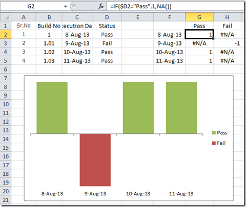
What I have done is added a chart data range that includes the date, a column for Passing results and a column for Failing results. I used a positive 1 for pass and a negative 1 for fail. Then I put that in an if statement and used the Excel NA() function, but I could have just used a zero value as well. After you create the chart, you will need to change the pass series fill color to green and the fail to red.
You can learn more about using the NA() in charts here:
How-to Make a Conditional Column Chart in Excel – REDO
Don’s Solution
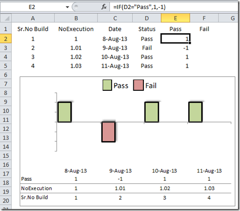
Interestingly enough, Don created a very similar chart. But he did his more efficiently by putting both results into one column instead of two. I probably over complicate things some times ![]() . Then the final step that Don did was to check the “Invert if Negative” checkbox on the Fill tab and choosing the positive and negative fill colors. Here is Don’s solution to this charting conundrum. Good one Don!
. Then the final step that Don did was to check the “Invert if Negative” checkbox on the Fill tab and choosing the positive and negative fill colors. Here is Don’s solution to this charting conundrum. Good one Don!
Both Don’s and my solution get around the 0/1 for pass fail that Ash was running into as well as changing the look from a line to an Excel Column Chart.
But wait, there’s more!
Below is a guest post by Peter on his take of the pass fail Excel chart from last Friday’s Excel Challenge. Thanks Peter! I liked Peter’s much better than my solution. Check it out.
Peter’s Solution
To come up with a viable solution to this problem, I had to think about what the end user was really trying to get out of the data and chart requested. I did not feel that a line chart would be the best way to show the data visually.
The first thing I did was copy down the data set into Excel.
Next, I wanted to code the “Pass” and “Fail” entries so that they could be charted in a meaningful way while also supporting easy data entry. So this is what I came up with…
Then, I made a calculation chart to manipulate the data into a chartable format.
This is what the data looks like…
These are the formulas that drive the output…
I used a custom number format to provide a text version of the number, based on the Pass/Fail Legend that I used. The custom number format is: “Pass”;””;”Fail”; This translates into “Positive Number”;”Negative Number”;”Zero”.
I made a Line with Markers chart for this data…
Then I copied and pasted the “Fail” Series into the chart…
This delivers a default chart that looks like this….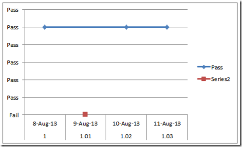
I removed the chart junk and formatted both series to remove the lines. This results in a chart that looks like this…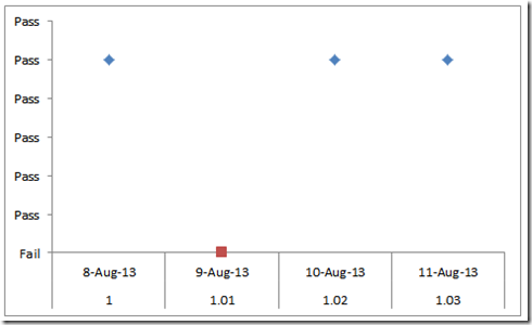
To change the markers to a check mark for Pass and a red X for Fail, I inserted a shape on the spreadsheet for each marker. I selected the X, used CTRL+C to copy it, selected the “Fail” series marker (the red square on the image above), and then pressed CTRL+V to paste the X as the marker. I followed the same sequence of events to change the blue diamonds to a green check mark.
Check out more about Custom Markers here:
How-to Make and Add Custom Markers in Excel Dashboard Charts
Finally, I added a few shapes and added a title to give my chart a nice clean look. The resulting chart looks like this…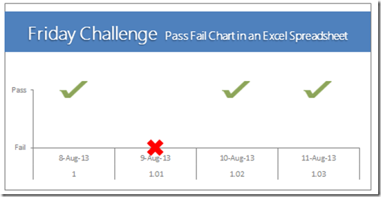
The only other thing that I did was to convert the Modified Data cells into a Table. This is a very easy way to make the chart dynamically grow as the data set gets larger.
Thanks Peter, you ROCK!
Video Demonstration:
Free Excel Download Files:
Excel Dashboard Template Pass Fail Chart File: EDT-Pass-Fail-Chart.xls
Don’s Pass Fail Chart File: Don-Pass-Fail-Chart.xlsx
Peter’s Pass Fail Chart File: PetesFridayChallengePassFailChart.xlsx
Thanks everyone for your great responses. Please remember to become a subscriber so that you get the next post delivered directly to your inbox.
Steve=True

