Okay, we have learned lots of different techniques to build our Company Executive Dashboard using Excel, and today I will give you a taste of one that I wish I had learned a long time ago.
Have you ever made a Pie Chart or a Stacked Column Chart and you wish you could delete a Slice of the Pie or a Section of the Stack?
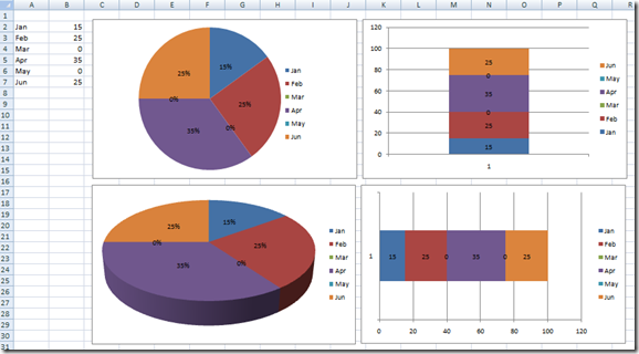
Here is a sample Pie Chart and Stacked Column and Stacked Bar Charts with Zero entries:
See how Excel puts in the Zero Pie Slices and also puts in the Zero Stacked sections?
Sometimes you want Excel to leave the Zero Pie Slices and Stacked Chart Sections and sometimes you want to hide these Zero Pie Slices in the Stacked Chart Sections. How can we control this?
Excel provides a great way to hide the Zero Pie Chart Slices but if you didn’t look for it, you may never have found it. This Excel Solution will also help us create Dynamic Charts and Graphs for our Company Dashboards. Lets take a quick look at the Excel Spreadsheet solution.
The Power of NA()
The easy way to hide Zero Pie slices or to Hide a Zero Section of a Clustered Bar or Column Chart is to set the values =NA().
Type =NA() in any Excel Spreadsheet cell and you will see that Excel translates the value to #NA. This is a Not Applicable error. Who thought that an error could ever be good! Well it can. When you chart #NA Excel typically ignores the point and doesn’t plot that point in the graph.
So you can either type in =NA() in the cells that are = Zero and where you want to hide the Zero Value Pie Slices or Stacked Chart Sections.
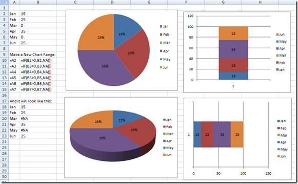
Alternately, you can chart a simple formula range that checks to see if the value = Zero and if so, set the new chart range cell = #NA.
Here is what it looks like and how it hides the Zero Pie Slices or Stacked Chart sections:
See the Zero’s are gone
Now that is way cool and we can use this technique in lots of different ways to hide all sorts of points so that we can highlight a chart and make it dynamic. However, that is another future post, but you have to grasp this Advanced Excel Charting Technique in order to understand how we will use it in the future for our Company Dashboard and Chart Templates.
Give it a try and leave me a comment/question if you are unable to figure it out.
Sample File:
Power-Of-NA-Error-In-Excel-Dashboard-Sample-Chart.xlsx
Till next time, this is Steve=True


