I have posted several Excel chart samples related to Clustered Stacked Column Charts.
In case you missed them, you can check them out here: Excel Clustered Stacked Column Chart Tutorials
Recently a user asked me how to add a line to the original data set found in this post:
how-to-easily-create-a-stacked-clustered-column-chart-in-excel
Check out how to do this with this quick and easy demonstration of that Excel Charting functionality.
The Breakdown
A) Create New Excel Chart From Scratch
- Add an Additional Line Data
- Create Chart and Switch Rows/Columns
- Change Chart Type for Line Data Series
- Basque in Your Glory (not a real step)
B) Add To An Existing Excel Chart
- Add an Additional Line Data
- Add Legend Entry (Series) to Existing Chart
- Change Chart Type for Line Data Series
- Basque in Your Glory (not a real step)
Step-by-Step
A) Create New Excel Chart From Scratch
1) Add an Additional Line Data
To create a Clustered Stacked Column Chart in Excel we would set up our Chart Data range to take advantage of Excel’s Multi-Level Category Labels functionality like this:
| Radio | TV | Internet | |||
| Product 1 | Bdgt. | 123 | 155 | 91 | 181 |
| Act. | 166 | 128 | 163 | 171 | |
| Product 2 | Bdgt. | 63 | 157 | 53 | 198 |
| Act. | 149 | 101 | 140 | 153 |
Therefore to add a line to the chart, we will need to add an additional data series to the chart data. We want to follow the same pattern that our horizontal axis categories are formed. In the way we have laid out this data, we want to add our new Target Line data series to the right of the Internet data like this:
| Radio | TV | Internet | Target Line | |||
| Product 1 | Bdgt. | 123 | 155 | 91 | 181 | 350 |
| Act. | 166 | 128 | 163 | 171 | 350 | |
| Product 2 | Bdgt. | 63 | 157 | 53 | 198 | 450 |
| Act. | 149 | 101 | 140 | 153 | 450 |
2) Create Chart and Switch Rows/Columns
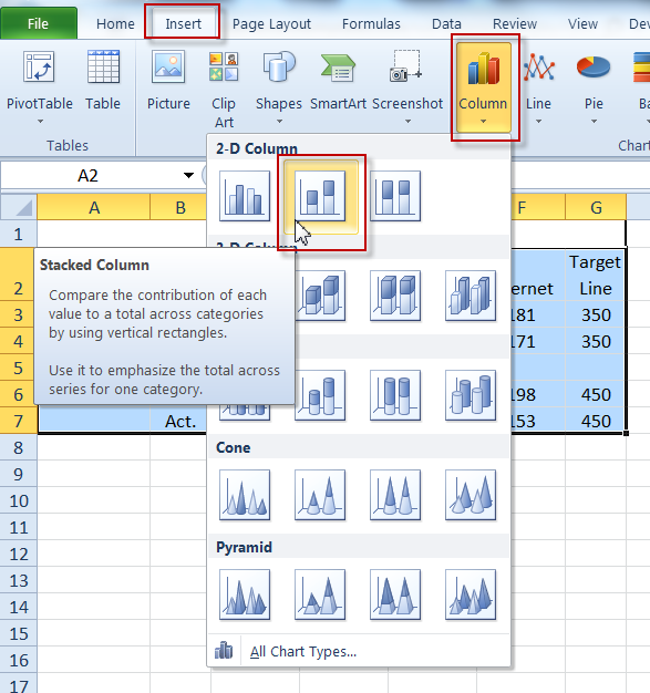
Now that we have our data series set up for the target line, we will next need to create the chart. To do this, select your data as you see above and go to the Insert Ribbon and choose a Stacked Column Chart from the Chart group buttons.
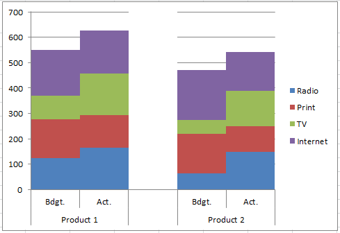
Your chart will now look like this:
However, we will need to Switch Rows/Columns to get our data to show up the way we want to display.
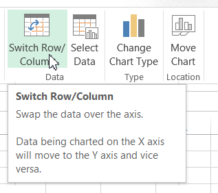
You can read more about why you may need to do this action here:
Why Does Excel Switch Rows/Columns in My Chart?
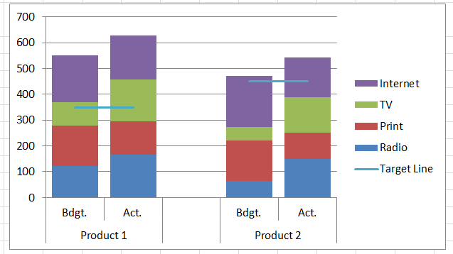
Your chart should now look like this:
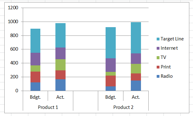
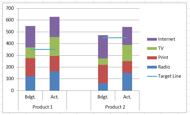
3) Change Chart Type for Line Data Series
The final step is to change the Chart Type for the Target Line series to a Line Chart. First select your chart, then select the Target Line Series. Then from the Design Ribbon, choose the Change Chart Type button and select the Line Chart for the series.
Your final chart should now look like this:
B) Add To An Existing Excel Chart
Note: This examples assumes that you have already created your Excel Clustered Stacked Column Chart as per the original example and you want to add an new line to it.
1) Add an Additional Line Data
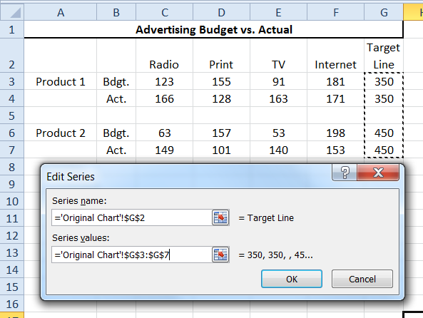
To create a Clustered Stacked Column Chart in Excel we would set up our Chart Data range to take advantage of Excel’s Multi-Level Category Labels functionality like this:
| Radio | TV | Internet | |||
| Product 1 | Bdgt. | 123 | 155 | 91 | 181 |
| Act. | 166 | 128 | 163 | 171 | |
| Product 2 | Bdgt. | 63 | 157 | 53 | 198 |
| Act. | 149 | 101 | 140 | 153 |
Therefore to add a line to the chart, we will need to add an additional data series to the chart data. We want to follow the same pattern that our horizontal axis categories are formed. In the way we have laid out this data, we want to add our new Target Line data series to the right of the Internet data like this:
| Radio | TV | Internet | Target Line | |||
| Product 1 | Bdgt. | 123 | 155 | 91 | 181 | 350 |
| Act. | 166 | 128 | 163 | 171 | 350 | |
| Product 2 | Bdgt. | 63 | 157 | 53 | 198 | 450 |
| Act. | 149 | 101 | 140 | 153 | 450 |
2) Add Legend Entry (Series) to Existing Chart
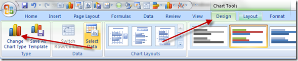
Now we need to add a new Legend Entry (Series) to your existing chart. The easiest way to do this is to select your chart, then select the Design Ribbon and then the Select Data button.
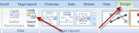
Then click on the Add button in the Legend Entries (Series) area.
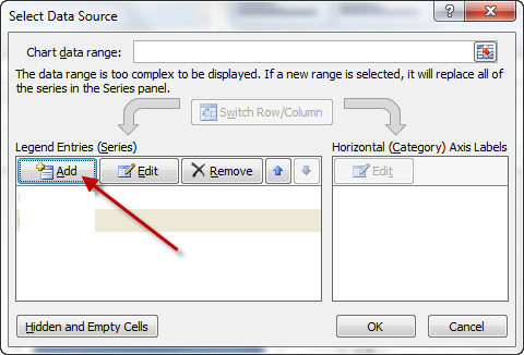
Then add your Target Line data series and click on both OK buttons
Your chart will now look like this:
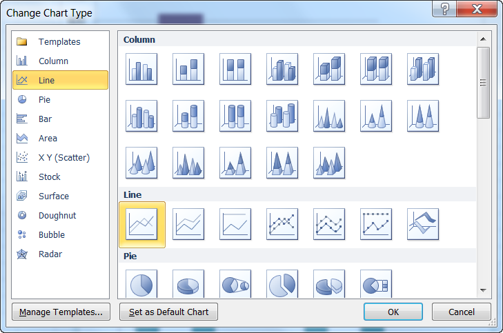
3) Change Chart Type for Line Data Series
The final step is to change the Chart Type for the Target Line series to a Line Chart. First select your chart, then select the Target Line Series. Then from the Design Ribbon, choose the Change Chart Type button and select the Line Chart for the series.
Your chart should now look like this:
Video Tutorial
Free Excel Sample Template File Download
How-to-add-lines-to-a-stacked-clustered-column-chart-in-excel.xlsx
Steve=True


