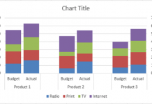
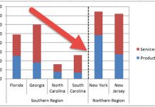
I am currently working on a project in L.A. and a business analyst at the client site was looking for a chart to present his data to the CEO. After looking at his data, what he wanted to present and how he wanted to present the data, I immediately thought of the Excel Clustered Stacked Column Chart. If you missed that post, you can check it out here:
How-to Easily Create a Stacked Clustered Column Chart in Excel
This chart was just what the doctor ordered. He watched the video tutorial and reviewed the step by step and made his own Excel chart right away. Then he asked me a question: I would like to put a percentage straddling the middle of both of the clustered stacked columns, how can I do that?
It is so neat seeing how people use my charts and graph tutorials and how they want to expand them. I wouldn’t have thought about this need without talking with him. So here is what we worked out to put a label at the top of the clustered stacked column chart, but the same principles will hold true for a clustered stacked bar chart.
The Breakdown
1) Set-up your data
2) Create 2-D Clustered Column Chart
3) Add New Series for % of Budget
4) Change Percent of Budget Series Chart Type to XY Scatter with only markers
5) Modify % of Budget Series Data Range
6) Change Marker Options Marker Type to None
7) Add Data Labels to XY Scatter Series
8) Link Data Labels to Worksheet Cells
9) Remove Secondary Horizontal Axis and Secondary Vertical Axis
10) Decrease Column Gap Width
11) Remove Legend Entry
Step-by-Step Tutorial
1) Set-up your data
The first thing we need to do is set up our data for the chart. The data setup for this Excel dashboard chart is as follows with the Clustered Stacked Column chart on the left and the XY Scatter chart on the right.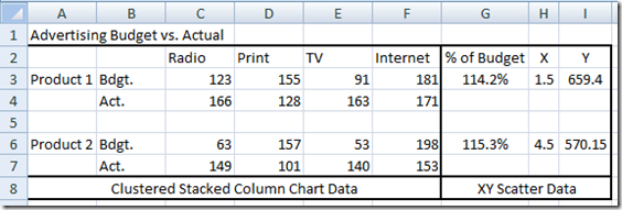
2) Create 2-D Clustered Column Chart
Now to create the start of our chart, we need to highlight the range of A2:F7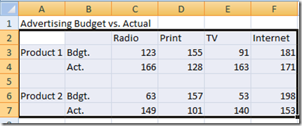
Then go to the Excel Insert Ribbon and choose the 2D Stacked Column Chart from the Column Chart Button.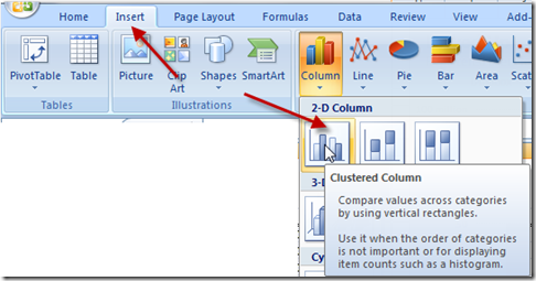
Your chart will now look like this: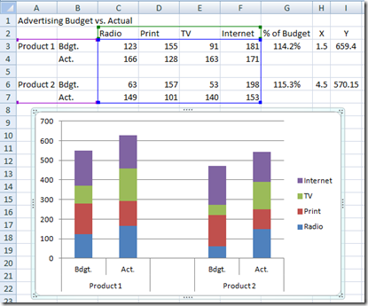
3) Add New Series for % of Budget
Now we need to create the data series that we will use for the centered data labels. The easiest way to do this is to pick a large value on your spreadsheet like the one in cell I3 (value of 659.4) and copy it. Then select the chart and paste it anywhere in the chart.
Your chart should now look like this: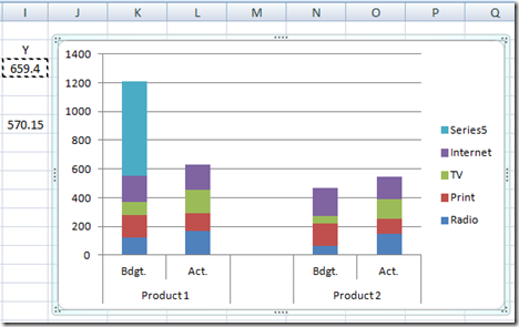
4) Change Percent of Budget Series Chart Type to XY Scatter with only markers
Now that we have added a new data series for the data labels, we need to change the Excel chart type of that data series to an XY Scatter with Only Markers Chart. To do this, select the new data series we just added (Series 5) and then go to your Design Ribbon and press the Change Chart Type button:
From the XY Scatter folder, choose the XY Scatter with only Markers chart type: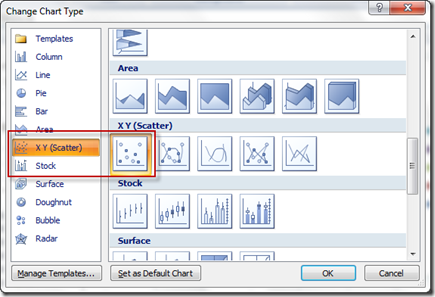
Your chart should now look like this with a small point representing series 5 showing up just above Product 2 clustered stacked column: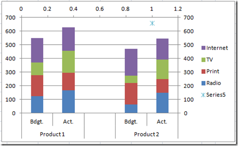
5) Modify % of Budget Series Data Range
So now that we have a data series in the correct chart type that we need for this Excel combination chart, we need to modify the data points for that series. To do that, we need to first select the Series 5 data series on the chart: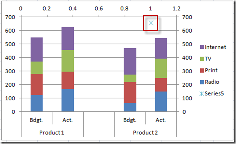
and then go to your Design ribbon and then press the “Select Data” button in the Data group:
You will then see the Select Data Source dialog box. Then you need to select “Series 5” in the Legend Entries (Series) area and then press the Edit button: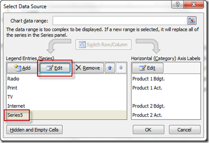
From there you will now see the Edit Series dialog box. Select the following ranges and press Okay until you get back to your chart: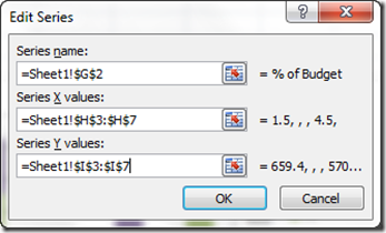
Your chart should now look like this with 2 XY Scatter Chart data points showing up for the newly named % of Budget series that used to be Series 5: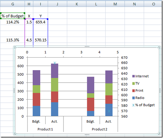
Don’t worry that the points don’t line up yet, that is because of the secondary axis options and we will fix that soon.
6) Change Marker Options Marker Type to None
So we have XY Scatter with markers only, but we don’t want to show the markers, we just want to use those data points to show data labels, so lets hide the markers. To do that, select the % of Budget data series: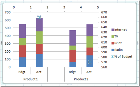
Then press CTRL+1 to bring up the Format Data Series dialog box. Then go to the Marker Options and choose “None” as the Marker type: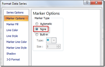
Your chart should now look like this (the markers are gone but I am still selecting the % of Budget series)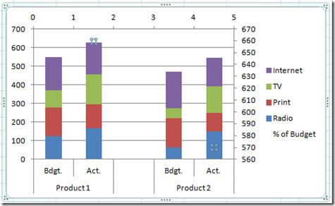
7) Add Data Labels to XY Scatter Series
Select the % of Budget data series. If you can’t seem to select it, check out this post:
How-to Select Data Series in an Excel Chart when they are Un-selectable?
Then go to the Layout menu and press the Data Labels button and choose Center for the labels:
Your chart should now look like this: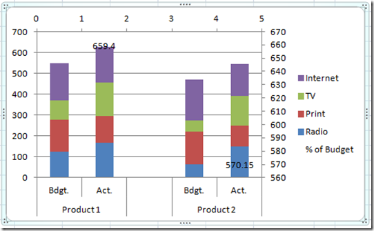
8) Link Data Labels to Worksheet Cells
So we now have data labels, but we need to link them to the data we want to show, not where the points were placed. To do this, select the “% of Budget” Data Labels. Then click on only one of the data labels a second time so that you are only selecting a single data label. Then press your “=” sign on your keyboard and then click on the data label that you want to appear. In this case cell G3 for the left data label: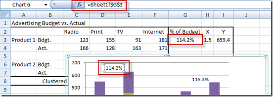
Repeat this step for the right data label linking it to cell G6 and your chart will now look like this: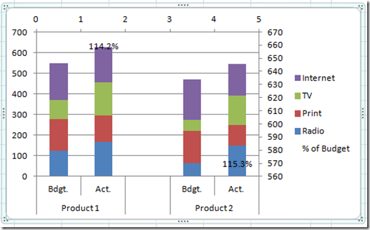
9) Remove Secondary Horizontal Axis and Secondary Vertical Axis
Now we are almost done. This step will align the data points to be centered over our Clustered Stacked Column Chart. Select both the Top axis and press your delete key and then select the Right axis and press your delete key. Your chart should now look like this: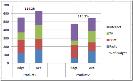
10) Decrease Column Gap Width
This step is a personal preference, but you may want to decrease the gap width of the Clustered Stacked Columns. To do this, select a column of data and then press CTRL+1 to bring up the dialog box Format Data Series dialog box. Then change your Gap Width to 0% or move the slider all the way to the left: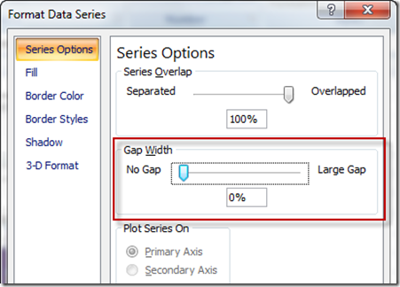
Your Excel chart should now look like this: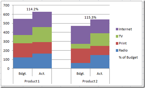
11) Remove Legend Entry
Let’s do a little chart clean up. This is a personal preference, but you may want to remove the extra data label from the legend. To do this, select the legend, then click again on the “% of Budget” legend entry: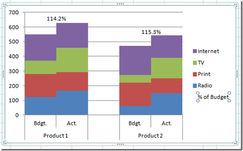
and then press your delete key. Your final Excel Clustered Stacked Column Graph should now look like this:
You use these same techniques to also create a Clustered Stacked Bar Chart.
Video Tutorial:
Here is a short video demonstration of this technique:
Hopefully you found this helpful. Please don’t forget to sign up and SUBSCRIBE to my blog so that you get the next post delivered directly to your inbox. Also, I will be sending out a special offer to my subscribers in the month of July. And please, if you like my blog and videos, please tell a friend or fellow business analyst. Thank you for your support!
Steve=True

