Can you help Kevin with his problem?
Kevin saw this article:
How-to Add a Line to an Excel Chart Data Table and Not to the Excel Graph
“Hi Steve,
Issue at hand: I am an engineer who wants to properly graph and show my boss how much time I am
designing/modeling 3D parts and assemblies.
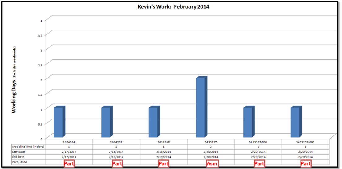
This ¡s what I currently have ¡n my table which I am pulling my data:
| A | B | C | D | E | F | |
|---|---|---|---|---|---|---|
| 1 | Part Number | Part Name | Part / ASM | Start Date | End Date | Modeling Time (in days) |
| 2 | Working Days | |||||
| 3 | (Excludes weekends) | |||||
| 4 | 2624264 | Guide, Cabinet | Part | 2/17/20 14 | 2/17/2014 | 1 |
| 5 | 2624267 | Rod, Cabinet | Part | 2/18/2014 | 2/18/2014 | 1 |
| 6 | 2624268 | Bar, Cabinet | Part | 2/18/2014 | 2/18/2014 | 1 |
| 7 | 5433137 | Bracket, Ammunition Box | Asm | 2/20/2014 | 2/22/2014 | 2 |
| 8 | 5433137-001 | Bracket | Part | 2/20/2014 | 2/2 0/20 14 | 1 |
| 9 | 5433137-002 | Plate | Part | 2/20/2014 | 2/20/2014 | 1 |
To create a 3D model a ‘Part’ it is simple:
To model a 3D ‘Asm’ (Assembly) it may take more time…thus I need to distinguish these two different variables in my table.

Here is what I get:
Here is what I would like:
Thanks – Kevin”
First, see if you can replicate the chart.
Then is what Kevin asking possible?
If not, how would you do to help Kevin?
Leave me a comment with your email address if you would like to submit a response.
Steve=True


