Many, many, many Excel users post this problem in user forums. And this one always throws me for a loop and takes me time to solve it. So I thought I would send it out to all the Excel enthusiasts to see if you can fix this Excel Chart.
The Problem:
1) Copy this Data into an Excel Worksheet
| A | B | C | |
|---|---|---|---|
| 1 | Tea | Coffee | |
| 2 | Jan | 300 | 1000000 |
| 3 | Feb | 700 | 5000000 |
| 4 | Mar | 300 | 5000000 |
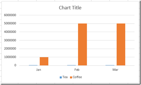
2) Highlight the Data and Create a 2-D Clustered Column Chart
However, my data series are not of the same scale, so, I decide to create 2 vertical axis’ so that the scales are distinct for the two data series. So then I go to the next step.
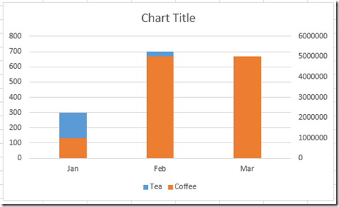
3) Move the tall orange columns to the secondary axis.
OOPS! This is not the chart I wanted ![]() . Why is my Excel charts now an Excel Stacked Colum Chart? I just want the two columns in my chart to be separated on 2 different vertical axis. How can I fix it?
. Why is my Excel charts now an Excel Stacked Colum Chart? I just want the two columns in my chart to be separated on 2 different vertical axis. How can I fix it?
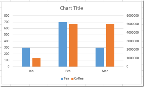
This is the chart I really wanted:
How would you make this 2-D Clustered Column Chart with two vertical axis scales?
Copy the data from above and give it a try. Let me know how you would create this chart in the comments below. Regardless, comeback tomorrow and see how we can handle this using Excel Charts.
Steve=True


