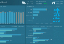
When Designing an Excel Company Dashboard you will want to make sure that your audience can easily read and interpret the data.
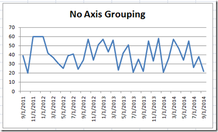
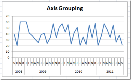
Which do you prefer?
Which chart would you want your Executives to view in your dashboard?
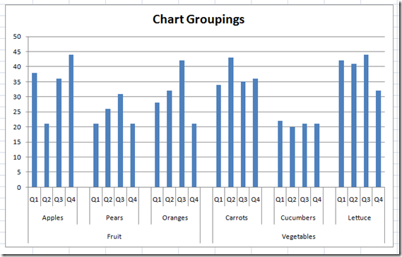
Your dashboard charts can be tiered with one or more chart axis groupings.
Here is a sample of a multi-tiered approach for an Excel Dashboard Chart grouping:
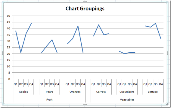
Here is the same data using a line chart instead of a Column Chart:
Would you use either of these charts in your Dashboard Design?
These are some simple charts that can be created using a little known Excel Dashboard Charting technique. Look for future posts on how you can learn to make these charts in Excel for use in your Executive Dashboards.
Steve=True

