Here is a fun and easy Dynamic Excel Chart that you can use in your Excel Dashboard Template.
This Excel Chart has many financial research, executive and company applications and it looks super cool.
In an Excel forum, I saw a post from excelsishya who was wondering how to create this type of chart:

Excelsishya – “I am looking For Straight Line (Horizontal) to be used in P/E Trading COMPS.”
The chart depicts a line representing the Minimum and Maximum Price-to-Earnings Ratio (P/E) for a given industry with a marker to compare the company’s P/E Ratio. There are also points on the chart that represent a given company’s price-to-earnings ratio and the industry average.
There are probably many ways to do this, but like I said that one of my goals is to try and do this without VBA and to make the Excel Chart dynamic so that we can use this as a Template in our future Dashboard projects.
Can this be done with a line chart?
Now most people might start to make this chart with a line chart, but although that seems like the correct way to go, Excel will treat each data point as a point in time and you will get line going up from left to right.
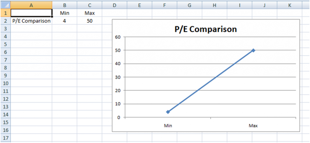
Not what we wanted. Excel line charts treats each data point as a series of consecutive values for the line.
Yes it can be done with a line chart
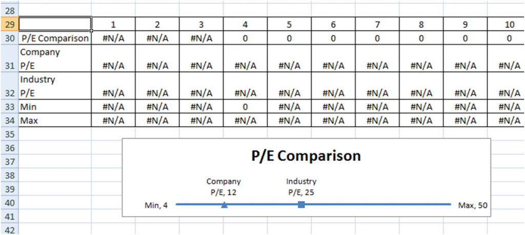
This can be done with using a line chart. First you will need to set up numbers 1-54 (a few more and after the min and max of the line we want to make.
Then you would have to create the line by filling in points 4 thru 50 with any of the same number so that the chart will put it as a
horizontal line. We put =NA() in the points 1-3 and 51-54 to give us space around the line and before the end of the x-axis. However, you will have a lot of data points to consider and this may not be the best way to make this chart for your Excel Dashboard Template. Mostly because you will have to plot so many data points for the line and markers. This example only has a line length of 50 or so, but what if the average was between 4 and 300. That would need to plot a lot of data points and is not very efficient nor is it easy to understand from a user’s perspective. Also, if we want it to be dynamic so that changes can be made easily in our Dashboard, this is more difficult with this type of chart. For instance, if the max changes to something beyond 300, we would have to add new
data points to plot versus just changing the values of the plotted points.
Price-to-Earnings Ratio Chart using Mircosoft Excel Line Chart
Here is a version of the P/E Industry Comparison using line chart.
There is a better Excel Chart Solution – XY Scatter Combo Chart
We can do the same chart that the executive team wants but instead of using a Line Chart for the Dashboard, let’s use the XY Charts. The Excel Chart is really quite simple once you understand how to set up the data and to use the chart features to your
advantage. I also feel that it is easier to understand.
Here are the basics what I think is the best solution to this chart:
- We will use an “XY Scatter with Straight Line” for the Straight Line chart.
- Combine it with an “XY Scatter with only markers chart” for the Triangle and Box points as well as the data labels.
This will reduce the data points from 270 for the line chart method down to 8 points for the XY Scatter method.
Here is how it works:
- Setup the data so that we make a flat horizontal line using XY coordinates from the min p/e to the max p/e.
- We do this by making the Y coordinates the same height for the Min and the Max. In our example, we will choose 1 as the height for the horizontal line.
- Then we set the X coordinates to the values of the min p/e and max p/e.
- We will use an “XY Scatter with only markers chart” for the label points for the minimum and maximum values as well as the company name when there is more than 1 company in the chart.
- We will change the default data point marker from Excel Charts to the desired triangle and rectangle. Alternately we can change the markers to a custom marker of your choice. We will cover that in another more detailed post.
- Finally, we will add all the labels and format the chart for your Dashboard Template.
Here is how your data will look:

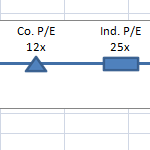
Here is how it looks using the combo XY Scatter line and marker only charts:
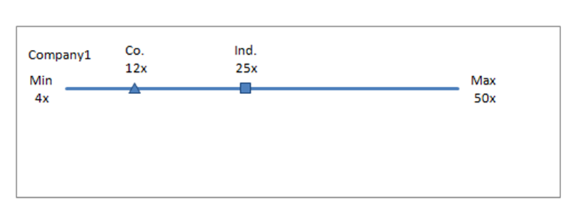
Just what the client ordered.
This post is already quite long, so in my next post I will walk you step by step on how to make the XY Chart for the P/E Company and
Industry Ratio in Excel for your Dashboards. I will also show you how to add multiple companies for market competition comparisons. I will also provide the sample file so that you can use it as a Template.
Please sign up for my newsletter so you will be the first to know when I have posted a new dashboard tutorial and also leave me a comment on what you would like to see.
Steve=True

